A Review of Nadia's website
Click on the image to send you straight to Nadia's website
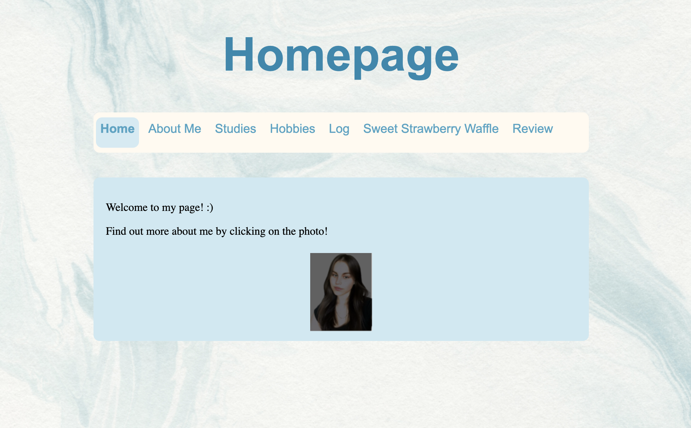
Design
Nadia's website features a minimalist design and clean layout. The homepage presents a welcoming message and a prominent photo, encouraging visitors to learn more about her. The use of whitespace and straightforward typography enhances readability. However, incorporating a consistent colour scheme and additional visual elements could further enrich the user experience.
Navigation and clickable elements
The navigation menu at the top of the page includes links to sections such as "Home," "About Me," "Studies," "Hobbies," "Log," "Sweet Strawberry Waffle," and "Review." This structure allows users to access different parts of her website. However, the current navigation lacks clear visual cues to indicate active or hovered links, which could be improved by adding styles highlighting these states. Ensuring that all links are functional and lead to the intended content is crucial for a seamless user experience.
Content
The homepage invites visitors to learn about Nadia by clicking on her photo. While this interactive element is engaging, providing brief introductory text or summaries for each section directly on the homepage could offer visitors immediate insights into Nadia's background, studies, hobbies, and other interests. This approach can entice users to explore further.
Future Improvements
To enhance Nadia's website, consider the following:
- Visual Design: Implement a cohesive colour scheme and consistent typography to create a unified aesthetic.
- Responsive Design: Ensure the website is optimised for various devices and screen sizes to provide a consistent experience across platforms.
- Content Enrichment: Expand each section with detailed information, images, or multimedia to engage visitors more effectively.
- Accessibility: Incorporate accessibility features, such as alt text for images and appropriate ARIA labels, to make the site more inclusive.
Conclusion
Her website establishes a solid foundation with its minimalist design and straightforward navigation. By refining visual elements, enhancing navigation cues, enriching content, and focusing on responsiveness and accessibility, she can significantly improve user engagement and satisfaction.