USABILITY REVIEW
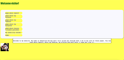
For the week 6 assignment, I will be writing a usability review for the webpage of Sebastian Wittag. When you first enter the page, there is a very easy navigation and welcome message that directs you where to go from there. As for happy talk, I do not think there is a lot of it. The webpage iis descriptive and to the point while still being dynamic. I believe the kind of language on Sebastian's webpage creates a friendly and welcoming environment. However, what I found different about the navigation is that the "Home" button is at the very bottom and my instincts/muscle memory expected it to be at the top. However, this might just be me. When you go on the "about me" page, I realized that there was barely any margin, especially between different blocks of text. This created a crowded look on the webpage in my opinion. I would recommend improving the page layout by adding more space between the different blocks of text, for example, the navigation bar and the content text or the picture and the content text.
In the "about my studies" page, I realized that this layout problem was less visible. There was more space between the navigation bar and the main text. I believe this is good because it looks better visually. I do like the "my studies" page better than the "about me" page. I did not feel any layout problems about the body texts of the rest of the pages of the website as well. However, a main layout review I would like to make is about the navigation bar. At the moment, there is a lot of unused white space on each page that also makes the viewer scroll all the time. What I mean by scroll all the time is that if you want to read the body text properly, you have to scroll down. However, because of the design of the navigation bar, when you do this, you can no longer see the full navigation bar. Therefore, if you want to go to another page, you have to scroll up again to see the full navigation bar. This takes away from the usability of the website. If the buttons were next to each other instead of on top of each other, there would be less unused white space and the need for scrolling all the time would decrease. This would both improve the usability and the visual appeal of the website.
On the topic of visual appeal, although the color yellow is a fine choice to have as a background color on each page, I believe a bright neon yellow (or any bright neon color) could make the user's eyes feel tired in time as it is very vibrant and stimulant. Therefore, switching for a softer yellow might be a good idea.
My final thoughts are that besides a few minor issues I found about the layout, Sebastian's website is very user friendly as it keeps the same design on each page and is easy to navigate. It also has a friendly and welcoming language which I find to be a very important quality.
