REVIEW
WEB USABILITY REVIEW:
There is, however, a clear visual hierarchy within the website, which comes to the fore in the navigation bar at the top, followed by the title of the page closed off with the content of the page, which is often accompanied by dividers to create clearly defined areas aiding in this structure. Some of the textual content indicates to the reader which hyperlinks would be clickable while all the links within the navigation and the text change colours while you hover over them with the cursor, indicating to the user that it is available to be clicked. There does not seem to be any design noise, however, the overall content design could prove itself to become more consistent, by making more use of a stylesheet that could be applied to each page to produce a more coherent whole.
When it comes to the texts, especially the PANCAKES and PROGRESS pages are easily scannable as you can indicate which information belongs to which title or subtitle by clever use of font sizes, lists and bold
The navigation menu still seems to be in progress. The menu is located at a prominent place on the top edge of the page but could become more noticeable to the viewer if the font size would be increased as buttons or a bar would be added to make a more eminent mark on the page. The navigation menu is consistent throughout the website and on all pages, a link to the HOMEPAGE is present, which is nice. The only thing missing is the Is there a 'you are here' indication, which could once again be added to the stylesheet.
Overall, the website has a lot of potential as all the assignments will still have to be completed and I look forward to seeing the final result.
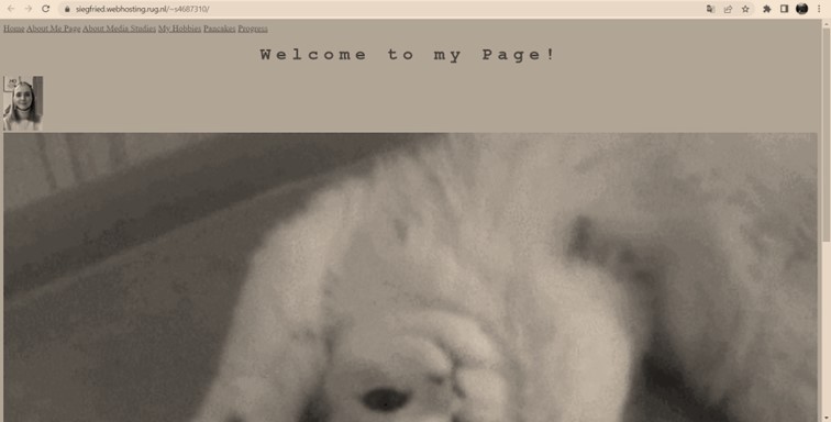 Franka Muller, Homepage, 2023. Screenshot, Rijksuniversiteit Groningen.
HOMEPAGE- FRANKA MULLER (2023)
The Homepage is the main web page of a website.The term may also refer to the start page shown in a web browser when the application first opens. One welcomes visitors on a homepage. You try to entice them by clicking to subsequent pages. However, it is possible that the visitor does not surf directly to your website, but ends up on another page via the search results. On many websites it is easy for the visitor to reach the homepage from this page.