KEEPING TRACK
KEEPING TRACK:
- Week 1:
- Within the first week I managed to add a navigation bar, a background colour, and lists (disguised as footnotes) to the site. I, moreover started to choose fonts, which I would like to work with later on.
- Week 2:
- In Week 2 I added the TRACK-page to my website and focused more on the general aesthetic of the site, in which I created an external stylesheet. In this week the overall colour palette was changed, while the site got a more recognizable and consistent style through blocks. When it comes to the stylesheet: I added a thematic break, a grid container and the style of h1. I, moreover managed to separate the colours of the topnav and body links.
- Week 3:
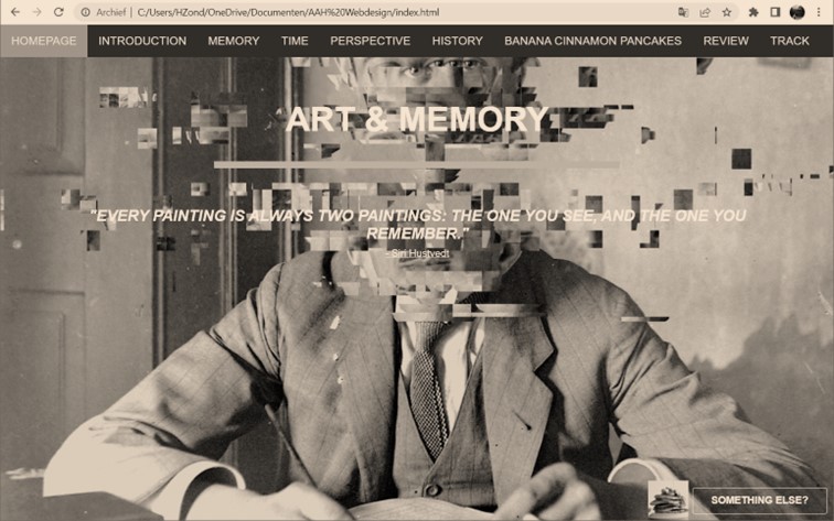
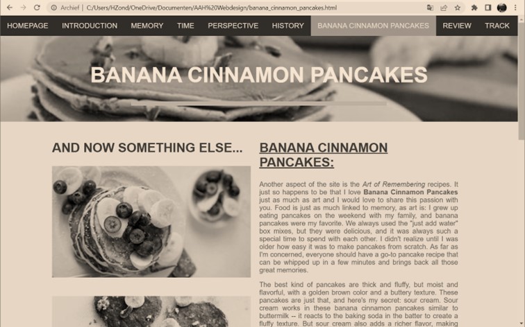
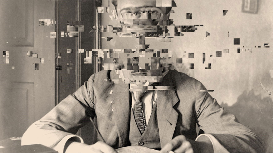
- Week 3 consisted of the optimalisation of the image sizes for the web. Especially the MAIN IMAGE, which has been reduced from 399Kb to 100Kb.
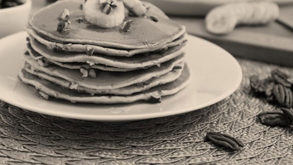
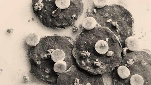
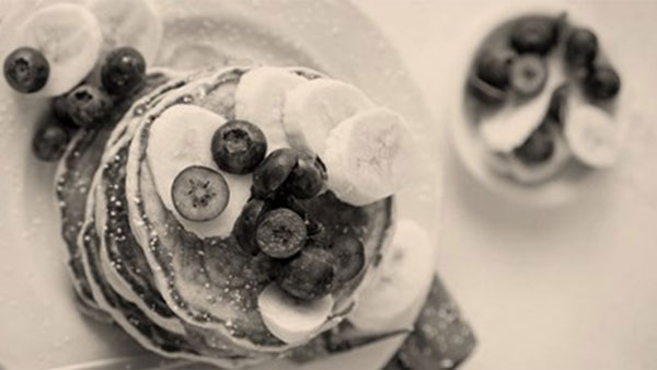
Secondly, I combined this week's, and next week's assignment in one: As the images of 'Banana Cinnamon Pancakes','Banana Cinnamon Pancakes 1', and 'Banana Cinnamon Pancakes 2' were cropped to the same width of 600px, while I added image maps to all of them. I, moreover, tried to achieve the highest possible image compression without a visible loss of quality, and created a seprate thumbnail of 100px, which was added to the HOMEPAGE and forms a link to the BANANA CINNAMON PANCAKES-page.
THE FINAL RESULT: