Web Usability Review
This review evaluates the Messi Fan Club website. Overall, the site is well-structured, with a clean layout, and its content is clear and easy to understand. Nonetheless, I believe that it could be improved by implementing a few small changes that could elevate this website to an even higher standard.
First of all, the navigation menu is prominently placed at the top of each page, making it easy to locate and access from any section of the site. It also highlights the active page by displaying its title prominently. This feature makes it easier for visitors when navigating as a visual indicator of their location within the website.
Regarding the clickable elements, the site does a good job of indicating which elements are interactive and which are not. For instance, the imagemap enlarges when you are about to click on it, indicating interactivity. Moreover, links are also highlighted to distinguish them from the main body text. The only improvement I would do in this sense is to get rid of some lines that aim to separate the sentences in paragraphs, such as in the Messi's Studies page. They may be mistaken for clickable elements or disrupt the reading flow. Removing these lines could enhance clarity.
The Messi Fan Club website does not have either distractions or design noise. The most important term of each page or the 'title' is bolded and displayed in a different color from the main text, which helps users to know which content to expect in the following sentences. The use of a sans-serif font enhances readability and ensures compatibility across browsers and devices. Besides, I do not detect 'happy talk', the content is interesting, free of redundant or incoherent sentences, and easy to scan. However, an exception is the 'Sweet Strawberry Waffles' page, where the centered alignment and dense text make reading harder, especially the numerical list in the "How to Make Sweet Strawberry Waffles" section. Therefore, I would suggest justifying the text in order to improve readability and to create a more uniform layout.
Another feature worth mentioning is the footer. I find it very professional and it also contributes to the website's usability. Its fixed position at the bottom of the page prevents interference with text scanning while scrolling, ensuring that it is always accessible without being obtrusive.
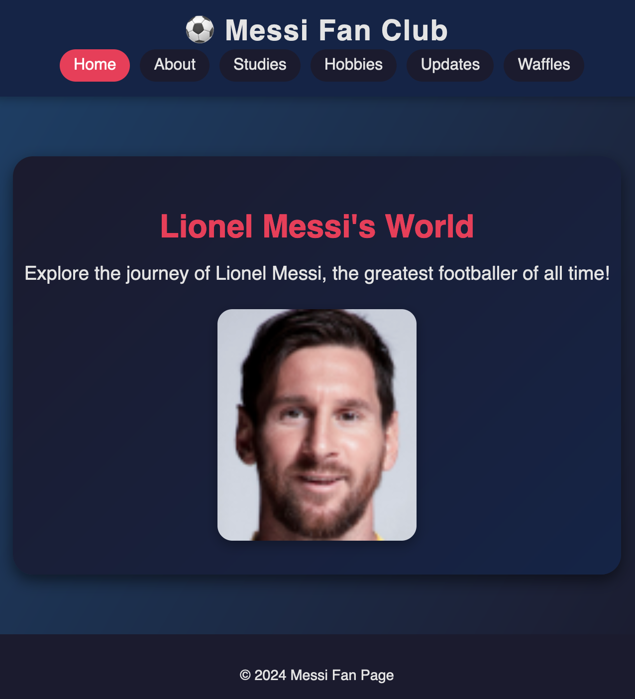
Finally, the homepage effectively introduces the website's purpose, particularly through the title and the picture of Messi. We can also find in this page the imagemap, which is very creative, as the body parts –eyes, lips and ears– are linked to different pages designed by the creator himself, rather than linking to external websites. This is a fun idea that maintains the aesthetic consistency of the pages, making the site more harmonious.
To sum up, the Messi Fan Club website is a strong project that combines many elements that make the navigation easy and entertaining. By addressing a few minor issues, such as the lines in the paragraphs and the text alignment on certain pages, it could enhance the user experience and become an exceptional quality website.