Usability Review
Visual Appearance
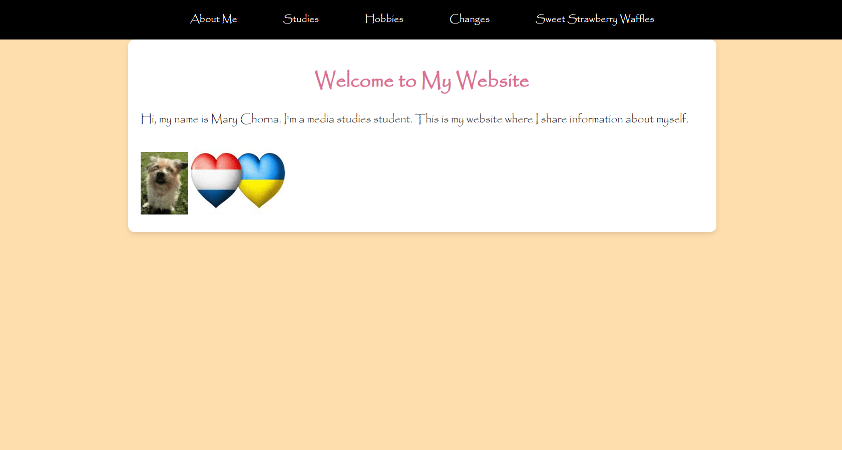
The site has a clean, minimalist design, with a focus on typography and a well-decided use of colors. The homepage features a header with horizontal navigation links, clear and simple text, and a identical layout that harmonizes all the pages thanks to the text-cointainers. Overall, its design prioritizes clarity and organization.
As for the navigation bar, it is obviously clickable since it is a simple horizontal menu, however, I think that the page you are on or the text itself should be underlined in some way, thus indicating that it is a link which will redirect you to another page.
As for the typography, I think it is not optimal. I think it is the "papyrus" font or something similar, which may not be recognized by all browsers. I would therefore recommend changing it to a simpler sans serif font. However, it is great how some elements are displayed in a more prominent way such as some of the "Sweet Strawberry Waffles" which is written in bold letters to attract attention.
As a summary of the visual appearance, I would say that, although the clickable elements are functional, they could benefit from visual cues such as color changes or hover effects. The absence of visual noise contributes to a clean and simple design. The texts are easy to scan due to their brevity, so I will define them as perfectly functional. All in all, the navigation bar is simple and well-placed, but lacks advanced features like current page indicators. While the link to the home page is present, there is no “you are here” system to guide the user. The home page briefly describes the purpose of the site, but could be more explicit.
Content
The content of the Studies page is brief and concise, explaining its current situation and even talking about the future, and it has also included an image of the University Logo.
The About Me page provides a clear and detailed explanation of how the imagemap works. It effectively describes the experience the user can expect when interacting with the map.
The site avoids any "happy talk," focusing instead on concise content that directly addresses requested purposes. This approach enhances usability by avoiding unnecessary text, and therefore ensuring that all information presented serves a clear and practical purpose. This communication style supports the site's functionality and aligns with best practices.
Final conclusions
The whole web has been designed carefully, as it is perfectly divided, with pictures that illustrate each page. As well, the navigation is user-friendly, with the navitation bar located at the top, and the text displayed in a centered container.
Besides, the chosen colours matches perfectly each page, as the body text and headings are included in the same colour palette.
The only things which can be improved in order to have the best version of this web are related to the visual aspects. As I mentioned before, the use of a certain font for the text can be a wrong decision as it may imply not to be displayed properly on every browser. And the most important terms are not prominently displayed so a change could be held into bringing emphasis on key content
When navigating the site, the name of the current page disappears from the navigation bar, which can be confusing for users. A better approach would be to keep the name visible and underline it, providing a clear indication of the active page and improving navigation clarity.