Review
Selim's Homepage
Here, I will provide a brief review of Selim's homepage.
General Style
> Is the most important term of each page also displayed as the most prominent one?
Mostly yes, except for the sweet strawberry waffles page. The page is titled "Welcome to Selim's World", which is the same as the homepage.
> Is it obvious what is clickable?
Yes. When I hover on a clickable text or button, the button changes color.
> To what extent is there distraction or design noise?
Not much. However, I personally feel that the footer texts do not necessarily need the marquee tag. It would be less distracting if the texts are simply fixed at a certain place.
Texts
> Are the texts easy to scan?
Yes, and no. The sentences are short and easy to scan. However, the main texts are centered on all of the pages, and it is rather hard to read. This is especially the case when the texts are in the form of lists because there is space between the bullets and the texts.
> Do you see 'happy talk'?
No, I do not see any 'happy talk'.
Navigation
> Is the navigation user friendly?
Yes. From the navigation bar, it is obvious what pages are included on the website. The navigation bar can show not only the main pages like "Home", "Studies", or "Hobbies", but the pulldown buttons implemented on the navigation also allows users to view the sub-sections included in each page.
Aside from the navigation bar, users are able to access the sitemap through the homepage, which gives a concise overview of what pages and sections are included on the website. It is also possible to access every page/section from the sitemap.
> Is it at a prominent location?
Yes, the navigation bar is situated at the top of every page, directly below the header. The navigation sitemap is also accessible, with the link situated at the very top of the homepage.
> Is it consistent?
Yes, Every page has a navigation bar created in the same style and positioned at the same place.
> Does it include a link to the homepage?
Yes, there is a "Home" tab in the navigation bar, which links to the homepage.
> Is there a 'you are here' indication?
Yes, the background color of the button turns from orange to brown to indicate which page the viewer is on.
Homepage
> Does the homepage clearly indicates what this site is about?
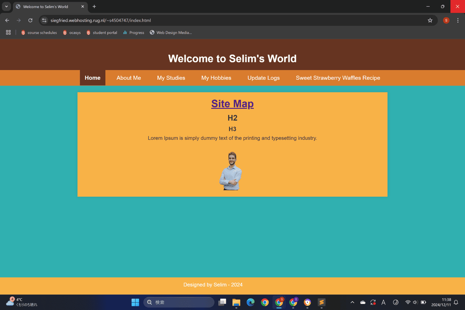
Not quite. The heading is more of a welcome message rather than what the site is about. There are also additional texts that do not have any meaning, including "H2", "H3", and "Lorem Ipsum". There is a self-portrait, but it is unclear what this is for because it simply appears so suddenly.
It is nice that the homepage has a link to the sitemap, however. It would be better if the text design is different from the default underlined blue font. Perhaps make a button, or include the sitemap as part of the homepage because there are currently no content on this page.
Other
> What other usability improvements can you suggest?
Some of the pictures included in the Sweet Strawberry Waffle page are a bit too large, especially the first picture right under the page title.
Also, the line width is probably wider than 545 pixels. This is also one of the requirements for the assignment, so the line width should be limited to 525 to 545 pixels.
As for the navigation bar, some of the menu items take up two lines when the browser width is small. It might be better to shorten some of them. For example, "My Studies" can be shortened to "Studies", "My Hobbies" to "Hobbies", and "Update Logs" to "Logs".