Reviewing Thomas' website
Here I will be reviewing the web usability of Thomas de Blaauw, which will be assessed by the topics below!
Is the site designed for scanning?
Yes, and here's why:- Is the most important term of each page also displayed as the most prominent one?
- Is it obvious what is clickable?
- To what extent is there distraction or design noise?
- Are the texts easy to scan?
- Do you see happy talk?
- How friendly is the navigation?
- Does the homepage clearly indicate what this site is about and what you can do at this site?
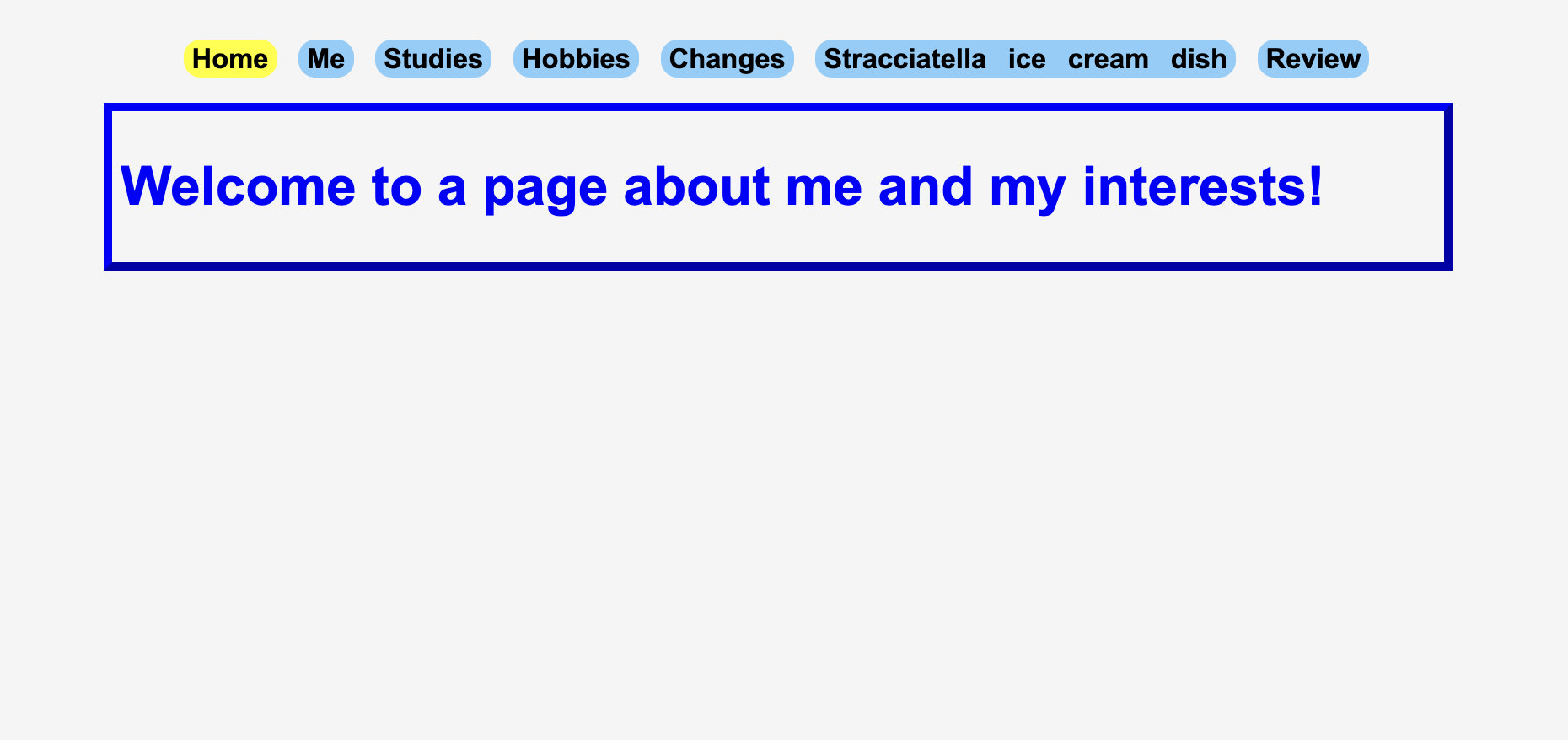
Yes, the navigation system is at the same position on every page, and it's clearly defined by changing colors on the page we are currently in. Headings are well-placed, making it easier to recognize what each section is about without needing to read everything in detail.
Other than the navigation system and the review link, there aren’t many links to click on. On the picture where it links to music, entertainment, and food, it would be helpful to state that above the image so that users know what to click and what clicking each part would do.
The page is quite simple, with a normal amount of images, so there are no distractions or design noise. The content is structured well, and there aren't unnecessary pop-ups or animations that could distract from the main point.
Yes, the blue text is a vibrant color with great contrast. The titles are bold and bigger than the normal text. The font used is a standard one and is easy to read. Paragraphs are short, which makes it easier to quickly skim through the content.
There are little instances of happy talk, such as 'Welcome to a page about me and my interests', which could be replaced with a small headline of all the necessary and general components of the entire website. Some texts feel slightly wordy, and shortening them to focus on direct information would improve user's reading.
It has a prominent location, it is consistent, includes a link to the homepage and there is a 'you are here' indication. The spacing between the navigation links is good, and users can easily recognize where they need to go next. A small hover animation on the links might look more clear and interactive.
Yes, the headlines are used to describe what each page will talk about and the navigation has a general idea of what each page will introduce. A short introductory sentence about the site’s purpose could be beneficial for the users.
What other usability improvements can you suggest?
I would suggest improvements on larger texts such as on the stracciatella ice cream dish or the review page, to make some prominent points more known and stand out, as the text looks a bit plain and disengaging. On pages with just text, such as studies and changes, it would make a greater impression if some links or pictures could be added, as well as adjusting the paragraph spacing and adding subtle visual separators would be helpful in breaking up larger chunks of content. A wider range of colour schemes may also give a better look to the site, making it read well but still visually attractive.