Web usability review
Hi! This will be a Web usability review of Tibbe's website, which you can find here: Tibbe's website.
Let's start talking about the "scanability" of this website. I think Tibbe did a nice job using clearly defined areas. It immediately becomes apparent what the content part of the page is and what the navigation menu is. A minus point however is that it isn't clear what page a user is on based on the navigation menu. On the other hand, the use of the button aesthetic makes it very easy to see what is clickable. Lastly, in terms of scanning, the website uses a background image that is kind of distracting, and the fact that it shows the image twice because it isn't large enough doesn't help I'd say.
Personally, I'd say the website looks very easy to scan for the most part, but that is mostly due to the fact that there is very little text to scan in general. Perhaps partially because of this, this website does not seem to include any “happy talk” as the only information included seems to be what is asked and what is most important.
Now let's discuss the navigation menu a bit more. Based on how the buttons are named in this navigation menu, it is very clear what they link to, and therefore it is very easy for users to find things they're looking for. However, as mentioned before in this review, this website does not properly show a user where they are on the website, and that might cause confusing and/or irritation to the users. This navigation menu is a good estimation of how big the site is, as currently the only pages that are available on it are the ones listed in the navigation menu (and yes this does mean that the image map is missing, or atleast I believe so, considering the fac that it was missing at the time of writing this review). My final thoughts on the navigation menu are that it is located in a prominent and consistent location throughout the website, which is very good!
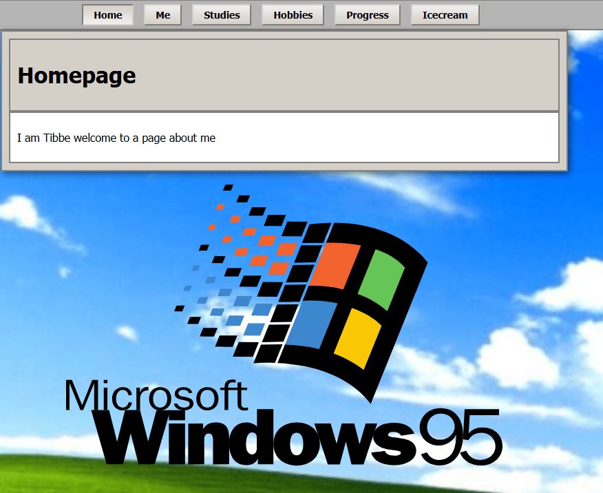
Now, let's talk about the homepage of Tibbe's website. This page is, in my opinion, lacking in the identity department. It is the most basic a homepage can get, with only the title of the page and, as quoted, “welcome to a page about me”. The full homepage can be seen in the image below. Personally I think this is not a good enough description on what this website entails, as there is plenty more to see that just about Tibbe, there is also information about his studies, the progress he's made throughout the weeks. It is a most basic description, that I think could be expanded upon.
Lastly, I have some suggestions on how to improve this website in terms of usability. The main one, that I've touched upon twice already throughout this review, is making the active menu item known to the user, as that helps a lot with navigation. Another potential addition to this website might be more text and explanation about certain things, on pages like the hobbies or studies page. Finally, perhaps the usage of a different background might make the website overall more coherent and less distracting.