For the Web Usability Review assignment I was tasked with reviewing Catalina Gangu's websites.
Follow this link to view Catalina's Website yourself!
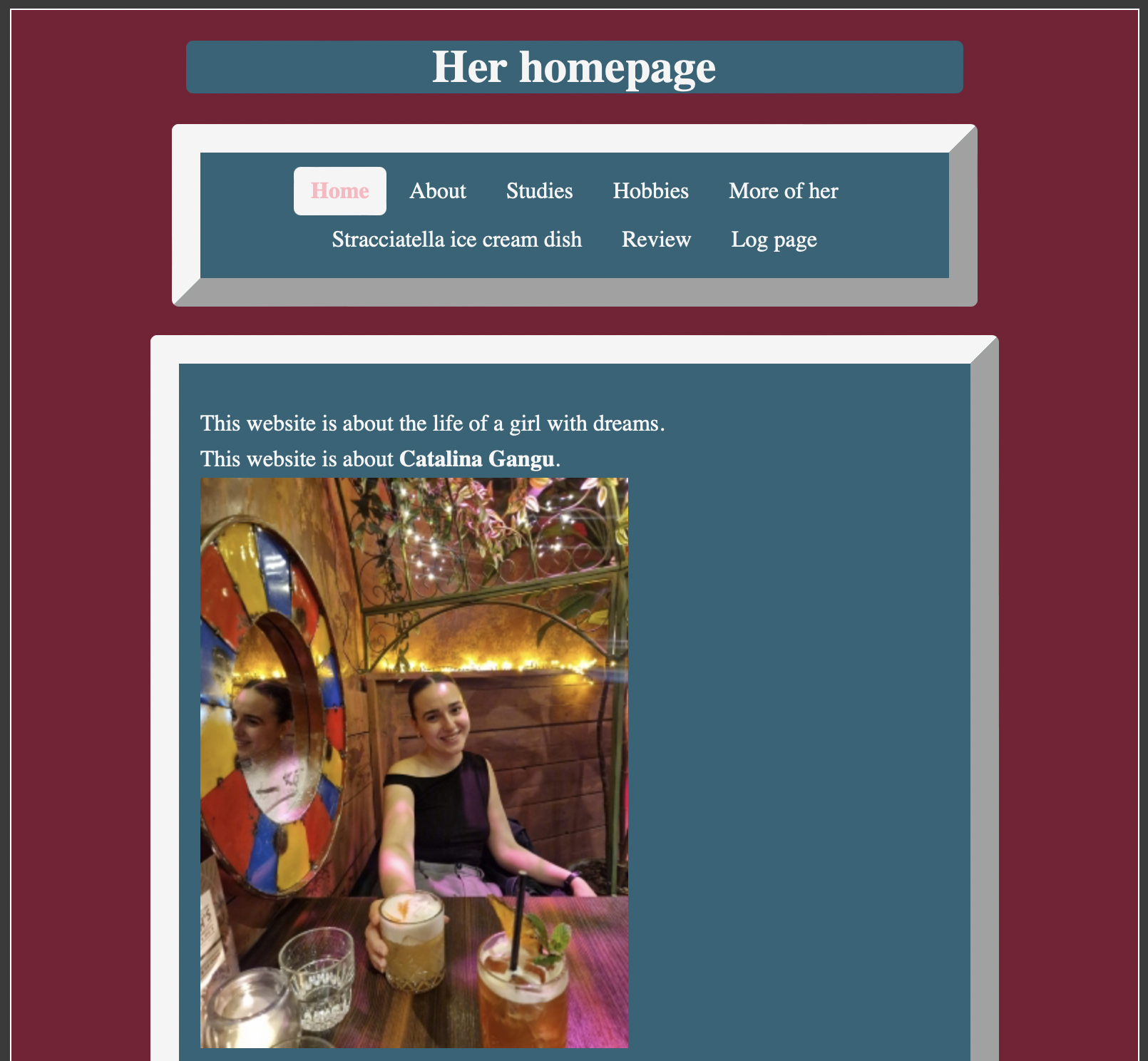
Navigational Structure
The navigation bar of the website is clearly distinguishable across all pages, due to its location in a separate box that is placed above the fold. It stays in the same place across all sites, even when scrolling down, which makes it easy to find and thus quite user-friendly. It also displays all the titles of the pages included, and all the links within are functional.
The specific items included in the navigation are not crowded together and are reactive to hovering, which makes it easy to understand where the cursor is currently located.
The menu item which is currently being visited is highlighted with its white background, which provides a 'you are here' feature, and allows viewers to understand which part of the website they currently reside on with a quick look.
To make it even more distinguishable, the color scheme could have been slightly changed, from that of the general website, but I believe this to be personal preference.
Scanning of the Text
The text of the website is very easy to scan, due to being sectioned in separate boxes. This also avoids large chunks of text being clumped together, which is great for usability!
Including bolded text parts of important information additionally aids the scanability of the pages, as it makes them more prominent to the eye. However, differentiating font sizes for subheadings above pictures, such as on the 'hobbies' or 'about' sites may make them more distinguishable at first glance.
Happy Talk
Catalina's homepage is very straightforward to read, and does not contain any unnecessary 'Happy Talk'. The content is very clear, which makes it a great usability aspect.
Further Suggestions
Catalina's website looks pretty great so far! However, I would recommend adding a small manual for the picture map on the 'more of her' site, as regular users would probably not know to look for such a feature.
Additionally, the images on sites such as 'about' and 'hobbies' are stacked vertically, which requires scrolling to view them all. Placing the images next to each other could make the design more visually appealing and user-friendly.
Final Thoughts
In summary, her website seems to be very appealing and user-friendly. It is very obvious that a lot of work and throught went into these webpages. Catalina even made sure to go the extra mile by including alcoholic beverages that may pair well with the stracciatella ice cream dish that she displays on one of her pages, which I think is a very nice touch!