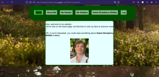
Homepage
The homepage is clear, although it might be good to include what the homepage is for, currently it is just a homepage with no reasons for us to continue clicking. It is unclear what the purpose of the site is, not giving the visitor a reason to continue looking through the site. Adding what the site is or what the site is for could help with that.
The link for the sweet strawberry waffles page is placed well and it is legible. Thumbnail is very well placed and it is clearly mentioned that it is a clickable feature.
Important Terms
The most important term is the most prominent on most pages, other than the homepage. It would be good to put the word homepage as a header on the homepage. This would also aid the consistency of the layout of the site.
Navigation
The navigation is good, it is clear which page you are on, and the placement is clear and prominent. The navigation is consistent in placement and look and has a highlight to show what page you are on. However the text becomes hard to see when you hover over the page you are on. This is due to the lack of contrast between the blue of the text when you hover over it and the color of the highlight showing that you are at that page. This could become an issue as the navigation becomes harder to read and thus a bit more difficult to navigate. I would suggest either changing the highlight color to a lighter colour or changing the colour of the text once highlighted to either a lighter or darker colour.
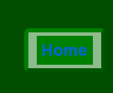
The font used in the navigation is easy to read and the homepage is included in the navigation on every page.
Scannability
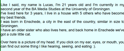
The length of the text is very scannable, it is not too long, and very easy to read in terms of word use. However, there is a lack of highlighting of important terms, which does not allow the text to be easy to scan. It might be good to bolden or italicize the important terms on each page such as the words BA and the name of the BA in the studies section. This would make the text look more organized and more easy to scan.
Beyond that the text could be divided into paragraphs better by using < p > rather than < br > between topics. This way there is a more clear break in a switch of topics or parts of the text. This would make the text even more easily scannable, and thus easier to look through.
Clickability
Clickable parts are made clear through being bold, which is good. They could be made clearer though through for example a line under clickable links or hanging it to a different colour than the rest of the text.
Design
The background is distracting, partially due to the clear line at the bottom of the page, which is very visible on the shorter pages. As well as the bottom of the image having a lot going on, distracting from the text, especially on shorter pages. On longer pages it is less distracting, although the bottom is still distracting. However a woodland background is a very good idea and could work very well, if a less bust photograph is chosen.
Happy talk
There is no happy talk. The text goes straight to the point, with no unnecessary additions. This is very good.
Extra
I would suggest more contrast between the background, the shaded part of the buttons, and the background color of the navigation might be good. Currently, the contrast, specifically between the buttons and the background color of the navigation is very low, but still slightly visible which is somewhat distracting. As well as being not very appealing to the eye, a small change in either hue, saturation, or brightness would work a little better to make the website more appealing and less distracting. The green chosen as the main color is quite beautiful and well chosen to not be too bright.