Hi, I'm Jule
Welcome to my world!
Review
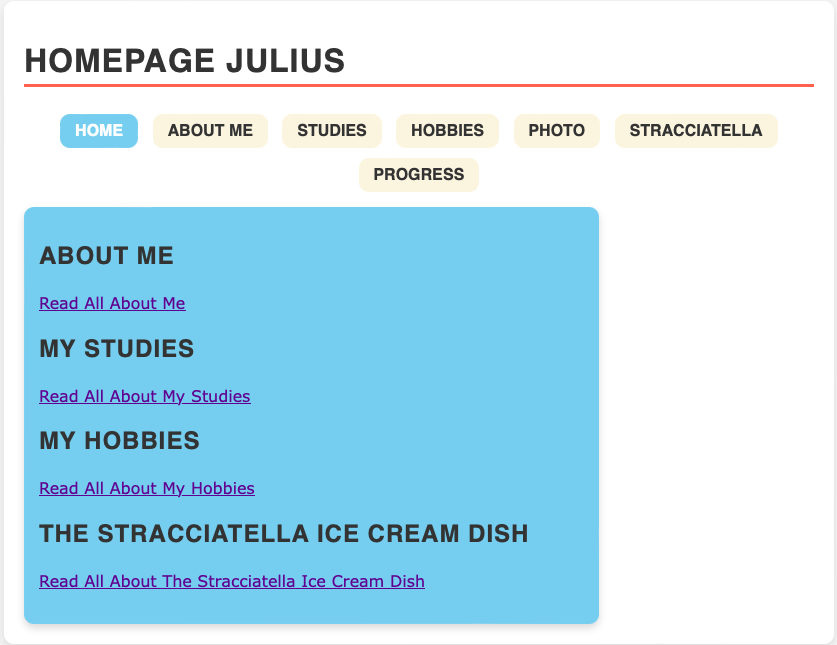
The given website has a very clear division and overview of menu items, it is very easy to navigate thanks to the bigger boxes and spaces and the left aligned text. It feels very natural looking at this page and finding directly what you are looking for. In the best way, this website certainly does not make one think (Kruger). The navigation presents a good overview and the active menu item is marked. Additionally, on the homepage I really like the blue box that links directly to other pages as well. And the button on the bottom of the other pages that links back to the homepage. However, the homepage is missing something like a teaser, as the following questions are hard to answer by just looking at the homepage: What is this? What do they have here? What can I do here? Why do I need to be here and not somewhere else? Therefore the website could benefit from a short welcome text or tagline. As mentioned above, there are clearly defined areas that make it easy to navigate. This includes a certain visual hierarchy between the navigation menu and the rest of the page, however excluding the navigation menu, the page does not seem to have a visual hierarchy. In general, looking through the rest of the pages the layout is continued, sticking to the colors and design, using lists and linking things which improves the usability of the site even further. The most important term of each page is displayed as the most prominent one, assuring that visitors always know what is the topic of the page they are looking at. Thanks to the hoover function and blue underlined links it is easy to detect what is clickable and what is not. The design is very appropriate, using some colours that go well together and even create a certain vibe but do not distract from the actual content. In my opinion, they underline and support the content nicely. The text is kept rather short and lists are used frequently, this makes the content easy to scan. There is no happy talk existent on this page, which feeds into the minimal text use and fits the overall vibe. The term “Get rid of half the words on each page, then get rid of what’s left” seems to be taken literally here. However, it does make the remaining text more important and visitors have to scroll less. The navigation is located at a consistent prominent location, it includes links to all existing pages, which includes the homepage as well. Furthermore there is a “you are here” indication which is really helpful when browsing and discovering more of the website. The homepage is very simple and direct and therefore indicates well what the webpage is about. As a usability improvement I would suggest to center the blue box on all pages. It makes it even easier and more natural to scan the pages. Lastly, as mentioned before, including a welcome text or tagline could answer questions visitors might have when visiting the webpage.