Peer Website Review
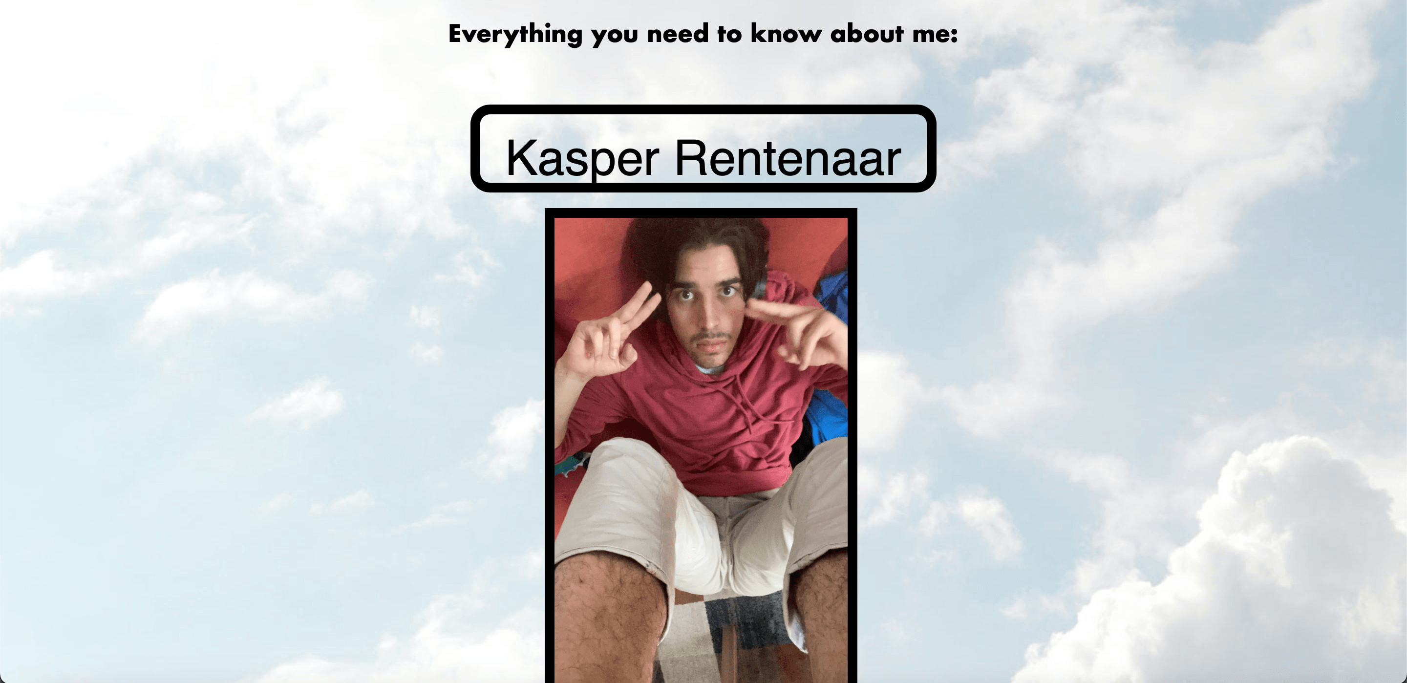
This is my website review for Kasper Rentenaar's website. I will be looking at the usability and design layout of his website. The website contains webpages dedicated to his personal likings, his hobbies, and his education. There also is a link from one of the web pages to access a Banana Cinnamon Pancake Recipe. Keep in mind this review is my own personal opinion. Look through his website to find out what the actual contents are B^)

The website has a vertical hierarchy structure, where you scroll down to view the contents. Your eyes are encouraged to follow the website from top to bottom rather than through left and right. You navigate the website through the Nav bar. I would move the Navbar on the homepage to the top so it is consistent throughout all the web pages. On all the other web pages the navigation bar is top-centre aligned. All web pages, except the banana cinnamon pancake recipe, are found on the navigation bar. The navigation bar also is reactive when you hover over it making it pleasant for the user to interact with it.

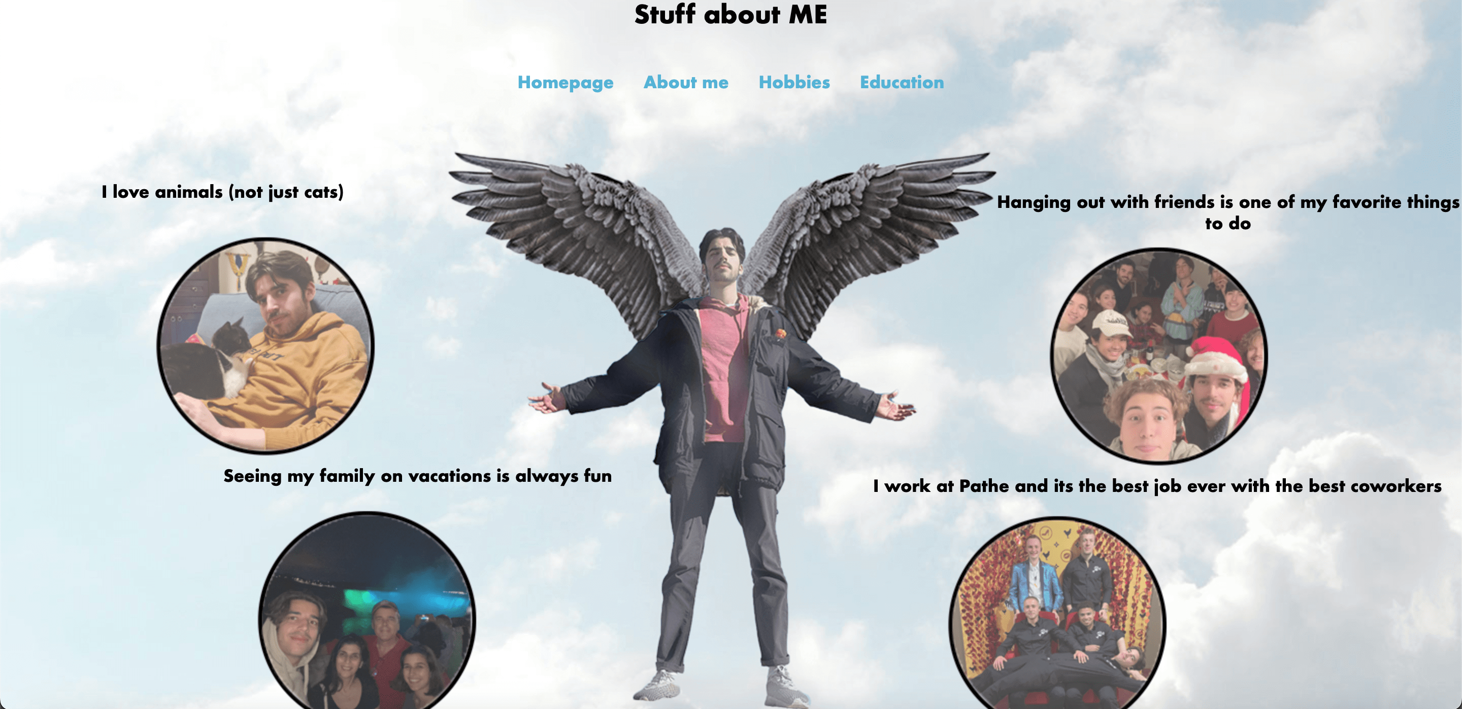
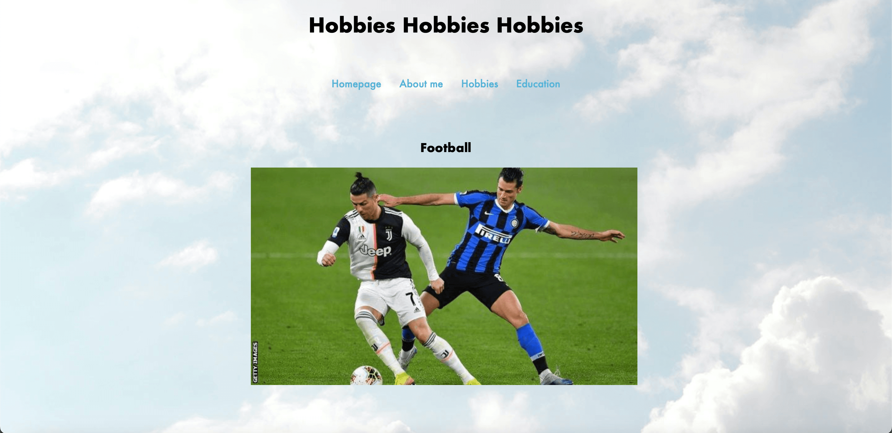
The website doesn't contain much text but utilizes images to display meaning. The 'about me' page has a very nice consistent design aspect for all its photos. The other web pages don't have this consistency, and have photos of different proportions. The web pages don't contain much text, but the recipe page does. I would have put a different block for the text so that it is another level of hierarchy and would be 'cleaner'. This would allow for more easier and readable text. An indication for headers would also help the user have an easier time scanning the website. The website does a good job of adhering to the course requirements but still expressing creative freedom.
