Review Usability
For this page I will be reviewing the usability of a website of one of my peers, which is
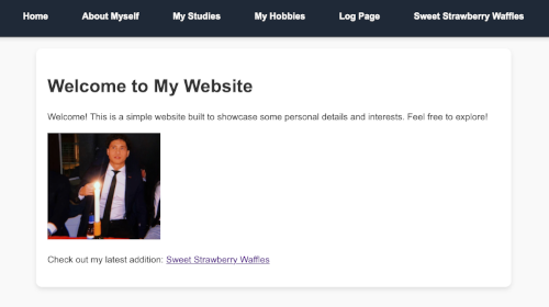
John Le. Which site you can see underneath here as well.
I will look at different aspects such as:
- If the most important term of each page is also displayed as the most prominent one.
- If it is obvious what is clickable.
- To what extent there is distraction or design noise, if any.
- If the texts are easy to scan.
- If there is any use of 'happy talk'.
- See if the navigation user is friendly
- If the homepage clearly indicates what this site is about.
- Lastly, what other usability imporvements I would suggest.
Positive Feedback
Overall the website is very well designed and very user friendly.
The most
important terms of the pages are clearly indicated with the use of headers. It is also obvious what is
clickable on all of the pages, there is no use of underlined texts that are not clickable which is a good thing. None of the pages are
distracting in any way. There is a simple design used that makes it very easy to use without any
design noise distractions. Because of the design choice it also makes the texts easy to
scan through everything, as well as the use of lists and bold texts. Furthermore, there is no '
happy talk' to be found on any of the pages, everything is very straight to the point and there is no unneccesary text on the pages.
Suggestions
As said before, the website looks very good and I only have a few minor suggestions. Starting of with the
navigation user, although it works fine I would suggest adding an 'active div'. This would indicate which page you are currently on after clicking on it. This makes it even more clearer for users to navigate the website. The 'hover' function however, was added and that makes it also a lot nicer to use, so that is a good thing. I do have one other point about the navigation user is that the
'Sweet Strawberry Waffles' page is only shown on the page itself and the homepage in the navigation menu. Make sure to have consistent navigation user.
As for the web design, I like how you kept it simple but I would suggest having a bit more contrast between the colors of the background and the background of the text itself. Personally I think that reads nicer, but this might just be a personal preference, as the shadow that is used around the background also helps.
Conclusion
I like the website, I think the best thing about the site is how easy it is to use and that it is straight to the point. All of the different aspects such as the important terms, clickability, easy to scan and no use of 'happy talk' are all very well implemented and show a good understanding of what a well designed website looks like.
If the suggestions such as, the 'active navigation' and making sure that the navigation menu is consistent overall, are implemented it would be easier but it is already very nicely done.