Web usability review
On this part of my website I will review the web usability of my fellow student
Nita Moesman (S4746651). The first thing I notice when opening their webpage is the colors. There is clearly a pastel, warm color scheme going on and it is very pleasing to the eye. Furthermore, the header with links is very conveniently placed so that visitors will immediately see everything they can find on Nita's webpage.
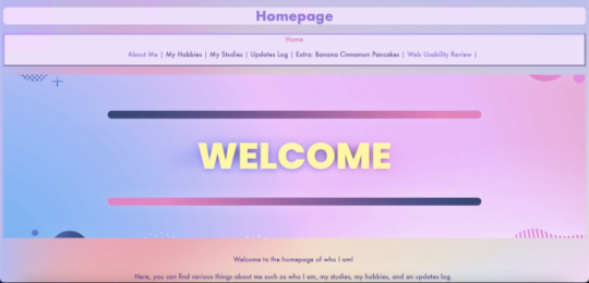
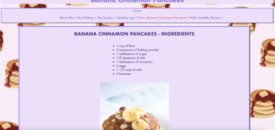
However, there are some small improvements that could be made. First of all, the link to the index page is placed above all other links. This makes the header with links a bit thicker. I think it would look nicer if this link was on the same line as the rest of the links. Secondly, when on the homepage, the "welcome" banner is quite large. You have to scroll down to read what the webpage is about. Eventhough this image is very pretty, for web usability purposes it would be better to make this banner a bit smaller. The same point goes for the div blocks used on all pages; they are rather large. For example, on the page for the banana cinnamon pancakes recipe there is quite a lot of text. However, some text fills the entire page, while other parts only really fill the center of the page. It would have been easier to read if the div block would have been a bit smaller and the text would have been more contained.
A nice little detail to the page is when opening the banana cinnamon pancakes recipe page. The background changes to a pancake background.
Overall I think Nita made a very nice, aesthetically pleasing webpage. It is easy to navigate to different pages and it is clear where to look. They also added pretty images that fit the aesthetics of the page, that make it feel more like a whole!
To visit Nita's website click
here