Review
Introduction
For this assignment, I conducted an in-depth review of Karlijn Pasman's website. The evaluation is based on fundamental usability principles, including scan-friendliness, navigation, clickability, design clarity, and overall user experience.
Visit the website here: Karlijn Pasman's Website
Usability Evaluation
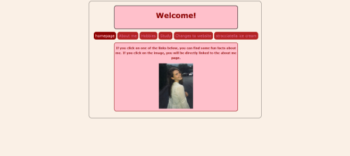
- Scan-friendliness: The website is structured with clear headings and sections, allowing users to quickly find information. However, better use of subheadings and bullet points would improve readability.
- Clickability: Most interactive elements are easy to recognize. However, some links lack hover effects, making it unclear if they are clickable.
- Design noise: The design is minimalistic, which reduces distractions. However, the contrast between text and background could be improved to enhance readability.
- Navigation: The website features a clear and consistent navigation bar, ensuring a smooth user experience. However, dropdown menus could benefit from subtle animations.
- Active page indication: The navigation highlights the active page, but the color choice (red) could be improved for better visibility.
Suggested Improvements
- Contrast enhancement: Increasing the contrast between text and background would make content easier to read, particularly for users with visual impairments.
- Better link indication: Adding underlines or subtle color changes on hover would make clickable elements more obvious.
- Enhanced scannability: Using bullet points, bolded keywords, and larger headings would help users quickly find key information.
- Responsive design: The website layout should be tested on different screen sizes to ensure a seamless experience across devices.
- Improved dropdown functionality: Smooth animations for dropdown menus would make navigation feel more intuitive and polished.
- Font adjustments: A slightly larger font size and increased line spacing could improve readability, especially for longer paragraphs.
Accessibility Considerations
Ensuring a website is accessible to all users is essential. Some aspects to consider include:
- Using alternative text for images to support visually impaired users.
- Providing keyboard navigability for users who rely on keyboard shortcuts.
- Ensuring color choices support users with color blindness.
- Maintaining sufficient font size and contrast for better readability.
Conclusion
Overall, Karlijn Pasman’s website demonstrates a solid foundation in usability principles. While it excels in structure and navigation, there is room for improvement in contrast, clickability, and accessibility. Implementing the suggested enhancements would significantly improve the user experience, making the website more engaging and user-friendly.
Reviewed Webpage