About Mees' website
scanning
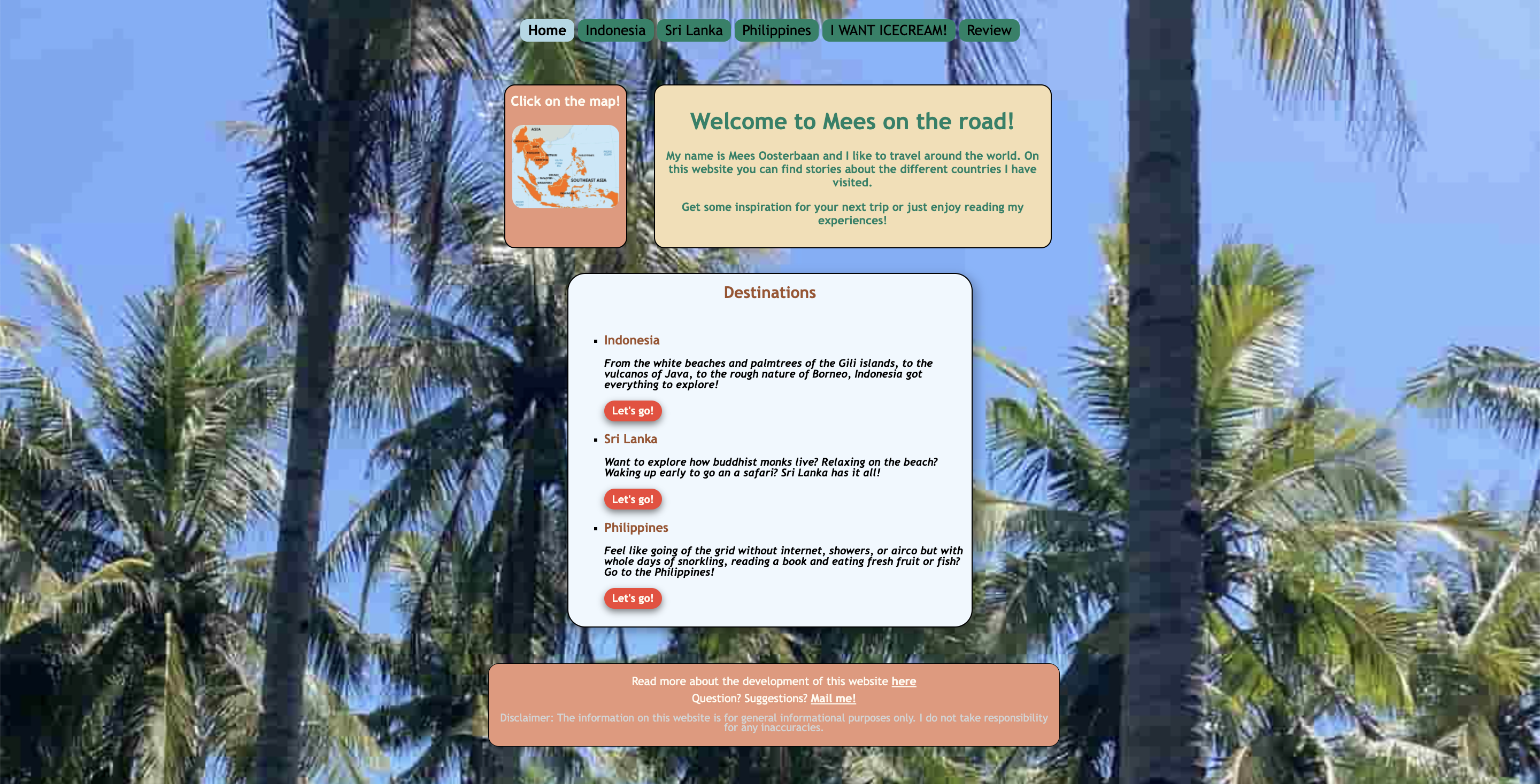
The title of the page, in most cases a destination, is the largest text on the page. However, the presence of many divs next to each other makes it difficult to follow a logical reading order. For example, the map on the left catches your attention first instead of the title and main content on the right.
This is different on the pages for Stracciatella and Review, where there is only one div, making it easier to focus on the content and follow the reading flow.
The text is easier to scan because headings vary in size and, in some cases, in color, helping to distinguish them properly. This makes it easier to understand the content at a glance, allowing users to focus on the most important information.
Clickable text is displayed as buttons or underlined links, making it easy to recognize. In the case of images, such as the map, there is also introductory text indicating that they are clickable. All interactive elements feature an animation when hovered over, reinforcing that an action can be performed.
design
I find the design distressing, because of having too many elements and colors. The visual noise affects the clarity and readability of the website, making it more distracting. I would recommend using a maximum of four colors and maintaining consistent heading properties. This would improve the web design by making it cleaner, more structured, and easier to navigate.
The background image effectively provides quick information about the content, helping users immediately understand the theme of the page. However, it contributes to the overwhelming design. In order to solve this, I suggest using a higher-resolution image and applying increased transparency or a color filter to make it softer.
clarity
From the homepage, it is clear what the site is about and what actions can be taken, not only through the text but also through images, such as the background and the map. All text is directed at the reader in a persuasive and creative way, resembling a travel agency, which enhances comprehension.
In general I foud the text good selected and easy to read, I did not identify any happy talk at all. The introductory information, which is the longest text on each country’s page, remains concise and direct.
navigation
Navigation is consistent, always positioned at the top center of all pages, providing an easy understanding of the available sections. It includes the homepage and other main pages. The only section not included is the weekly website update, which can be accessed from a div at the bottom of the page via a hyperlink in clearly worded text. The page you are currently on is highlighted in a different color (soft sky blue) which contrasts more with the text than the dark green used for unselected pages.
What I find awkward is that each time you navigate to a new page, it opens in a new browser tab. This quickly becomes annoying as you end up with too many tabs open, making it harder to manage your browsing.
click on the screenshot to visit Mees' website