Review
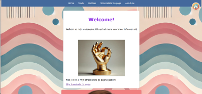
This review will focus on Timo Geluk's website. Below is an image of his website.
Is the site designed for scanning?
Yes, you could say that the site is designed for scanning. The homepage in terms of text is very simple, with simple welcome text and a navigation bar. The navigation bar is good to quickly find specific pages. There are also images everywhere, and on the homepage, but the space within the text and image still make it scanable. Overall, there is very little text, but the amount of images make up for it and makes it a very interactive website. There is however a very distracting AI image as a background, which could be changed.
Is the most important term of each page also displayed as the most prominent one?
The homepage title is moving, which is a nice touch, but could also be lost in your vision by only seeing half of the word. The rest of the titles do not move, and I think this is a little better for clarity purposes. Headings are clearly defined for the rest and images or visuals.
Is it obvious what is clickable?
It is quite obvious what is clickable like the hover effect on the navigation bar, but i also see that a similar hover effect is applied to the images as if they are clickable, but they are not, maybe consider removing these. Overall, the things that are supposed to be clickable are identified very easily, and he even added a hover effect to the home button on the right which is a nice touch.
To what extent is there distraction or design noise?
I can not lie in the fact that there is some amount of design noise. The main thing here is the background and the contrasting colours. Maybe align the colours of the navigation bar to the background and home button and vice versa. In this way it will be a little more coherent and less cluttered. The text and div sections do have its design language in mind and are all similar across the board which is good, but in combination with previously said design noise it still looks a little much.
Are the texts easy to scan?
There is not much text, but the textthat is there is very easy to scan. The best example i can give is on the straciatella ice cream page, where heading and paragraphs and lists are clearly defined and implemented. Overall good job with the scanability of texts.Do you see 'happy talk'?
Because there is not much text about himself and only on the straciatella ice cream page, i can not really identify much happy talk. This is not that big of a deal to me though as everyones language use is different.How friendly is the navigation?
The navigation bar being on the top is very friendly. The navigation bar could use something to know which page you are on, like a class=active tag for each page that you are on. For the rest, the navigation bar is has singular words for some of them, which is good, but could make use of more contrast for active pages.
Does the homepage clearly indicates what this site is about and what you can do at this site?
The homepage clearly defines what the site is about. I mean, it is not that hard to define this and it is done in a singular sentence, but I believe there is not much else you can tell about the usage of the website so i think it is good.
What other usability improvements can you suggest?
I think a colour palate could be of good use to your website for overall coherence and consistency. This would also make your visuals pop out more and less cluttered. I already said this multiple times of course, but I think it will be a great addition because there would not be much else to add or change.