Usability review
Review of Kimia's site
 Scanning
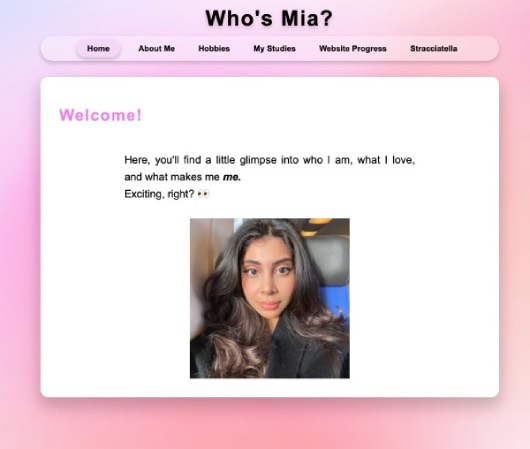
When I looked at Kimia's website, I immediately thought that her website looked really good. At her homepage, it is clear that she introduces the rest of her website and that she wants to welcome people on her website. For all her pages, the titles are purple and therefore the most important terms immediatley are the most prominent. Especially because the background of her textblocks are in white. The backgroundcolor of her website matches the rest of her design and color use and is not too distracting. Her navigation menu makes it clear what text is clickable. All the blocks that you can click on get a border around it when you hover over them. Also the color changes from the same color as the background, to a darker color. This makes it clear that you can click on them.
Text easy to scan
On some pages, the texts are easy to scan as Kimia uses multiple headings on these pages. On the stracciatellia ice cream page for example, she uses different headings and gave them a pink color. You can see that here. There are however multiple pages on her websiite that contain quite a bit of text but do not have headings. This makes it sometimes hard to follow and can be a bit overwhelming when you try to scan the website. For the page that shows the changes to her website, she for example does show that she is writing about week 1, 2 etcetera but the weeks are in the same color. You can therefore not really see where she starts talking about a new week.
Happy talk
Overall Kimia does not use that much happy talk. She just writes a lot about her hobbies and experiences and in my opinion it does not feel like unnecessary information or happy talk. On her welcome page there is just a short introduction but no useless text. One thing that could be seen as happy talk is the sentence "Anyways, nice to meet you!!!", on her about me page. But that is the only sentence that maybe is a bit unnecessary.
Friendly navigation
The only thing that is missing in the navigation menu, is a clear indicator that you are on a certain page. Right now, the navigation menu does only show with a darker color that you are at the homepage. For al the other pages, it still keeps this darker color on the homepage button. So it does not change when you find yourself on a different page. The navigation menu does have a consistent location on every page. It is located on the top of the page before the actual title and text of the page. The navigation menu does have a link to the homepage on every page of the website.
Homepage
The homepage is very clear. She makes sure that she does not add too much text on the homepage. Instead she clearly explains with a very short text what people can expect to read an find out about on her website. The only thing that she could add is a little explanation about her image. She could for exmaple write that people can click on her image to be directly linked to the about me page.