Web Usability Review: Seiko Ishii’s Website
This web usability review evaluates the website from Seiko Ishii focusing on its design, navigation, and content. You can access the website when clicking on this link: Seiko Ishii's Website.
Design and Aesthetic
I really like the overall aesthetic of the website. It is very well throughout when it comes to the colour scheme, the different elements and the design. I like the plain, modern design as it is easy to navigate and not overwhelming at all. I don’t think that there are any distractions or design noises, as the design was kept very clean and modern, making the website appear very professional.
Headlines and Visual Elements
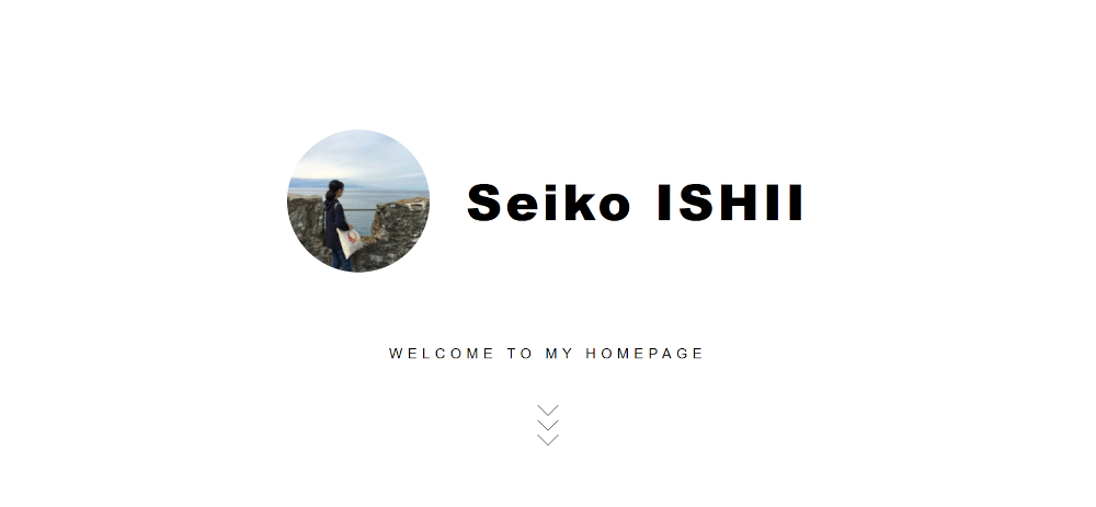
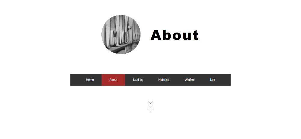
Each pages headlines are prominently positioned at the top in bold letters, making them clearly recognisable. Therefore, it can be said that the most important terms are displayed as the most prominent ones. However, I think the “Welcome to my website” header could be more present to draw attention. I also appreciate that each page has its own logo picture.
Clickable Elements
Clickable elements are easy to identify thanks to the use of distinct colours and underlines for links. There are also helpful explanations, such as those for the logo on the homepage and the images on the “About” page.
Content and Scan-Friendliness
Moreover, the websites are scan-friendly as there is not too much text and the text length is limited. Often texts are located within boxes or within timelines and lists, making it easy to recognise text and skim through it without feeling overwhelmed. There is no “happy talk” as there is not much text at all. In my opinion a little more text would actually not be bad as the visitor would have a little more guidance, but that might be a personal preference. For example, on the “sweet strawberry waffles” site it would be nice to have some more description or detail, which might also improve the sites Search Engine Optimization (SEO). Overall, the content is concise and to the point, making the websites not overloaded but easy to follow.
Navigation
The navigation menu is user-friendly as it is recognisable as navigation and appears almost consistently at the top of the pages, except for the homepage. On the homepage but a menu which can be found when scrolling down a little bit. While this design choice works, it might be better to include the navigation menu at the top of the homepage as well. This would make the layout more uniform and ensure the menu is the first thing users see. The navigation bar also includes a link to the homepage, and highlights the active page with a red background, which contrasts nicely with the dark grey used for the other menu items.
Website Purpose
However, the homepage doesn’t clearly communicate the purpose of the website right away, as you need to scroll down first, in order to get more information. While the name “Seiko Ishii” and the phrase “Welcome to my website” provide some context, a brief introduction or welcoming message could make the homepage feel more engaging and informative.
Conclusion
In summary, Seiko Ishii’s website offers strong web usability through its simple, modern design and user-friendly navigation. With a few adjustments, such as more prominent introductory text on the homepage and slight tweaks to the navigation and content, it could be even better.