Introduction
The website I am reviewing in terms of usability is that of
Bets Kramer (S4382900). The name on the student list is Bets Kramer but Bente de Boer on the website.
In reviewing the website, I will be looking for coherency, clearness, and convenience. Please note that I had to translate the text on the website as it is in Dutch, which is no problem, but that there may be mistranslations that could be reflected in my comments.
First Glances
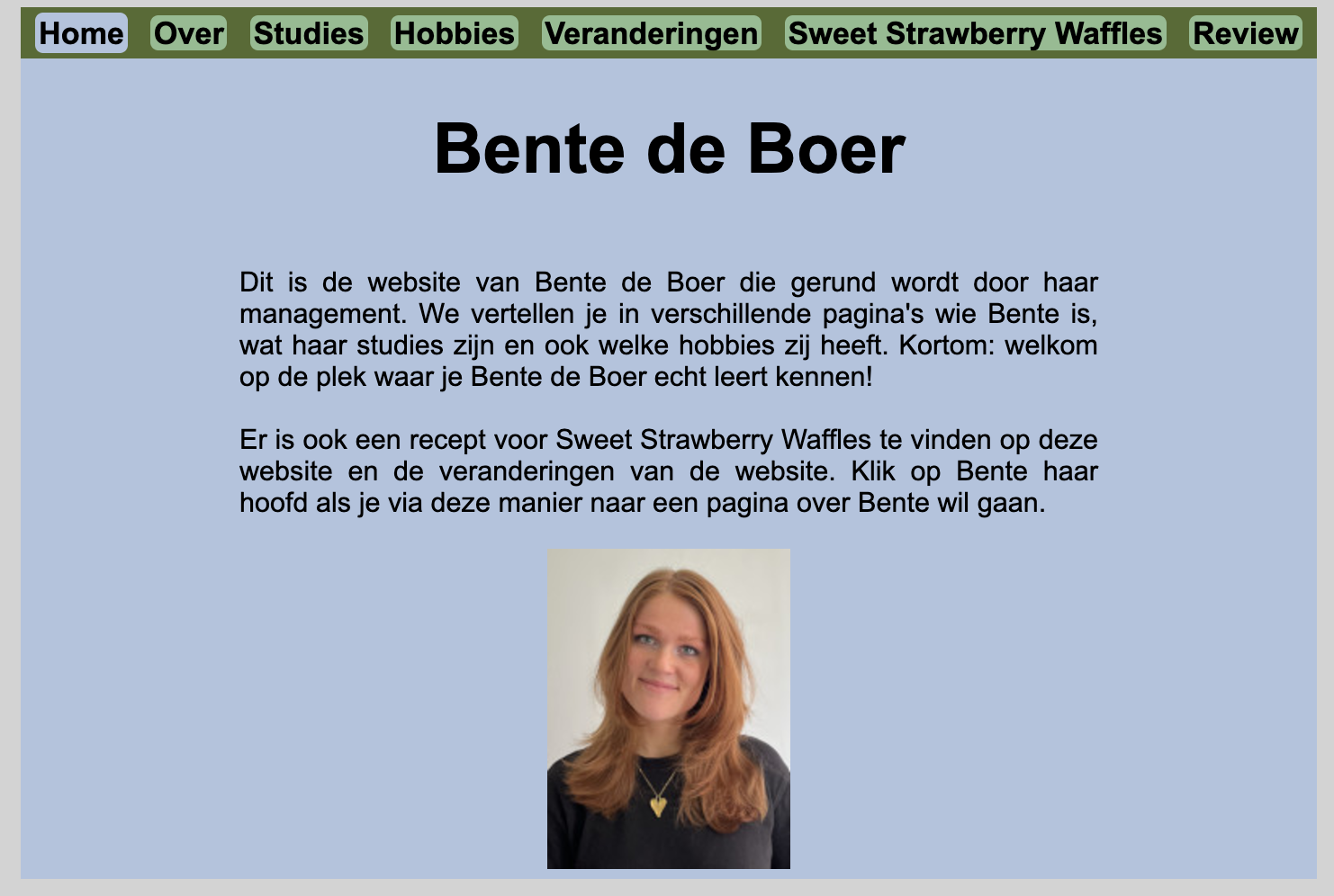
At first glance, the website is not missing any required features; there are the seven pages, a navigation bar, and a heading on every page, including images in some. In addition, the most important term of each page is displayed as most prominent. They are also H1 and in bold, so it is immediately clear what each page is about. For example, the homepage clearly and enthusiastically explains what and who this website is about, so the user does not need further clarification.
While there are no links on her pages, the “Over Bente” page explains in the text that the image is an image map, with different parts of her facing leading to different things. Therefore, the text and images compliment each other and the user is guided through the website’s features.
The Navigation Bar
The website’s navigation is indicated through a navigation bar on the top of the page, consistent throughout each page. It is clearly identifiable as it is a distinct dark green, in contrast with the baby blue background of each page. Each page title in the navigation bar, including one for the homepage, is in bold and has a border surrounding it, making it apparent that they are buttons to click on. The ‘button’ of the visited page is also the color of the background, which I think is a nice touch of coherency and clarity, as it informs the user which page they are on. Thus, I find the navigation bar very user friendly.
Distraction or Design Noise
In terms of distraction or design noise, I would say it is minimal to nonexistent. Each page is relatively minimalist, and straight to the point. In addition, every page is symmetrical, so it is pleasing to the eye and balanced. While this is positive, I do think the website could be more visually stimulating. Perhaps the background and navigation colors could be brighter or more vibrant, and the body text could be placed within a text box, just to make the pages more eye-catching. Nonetheless, this is personal preference.
The Text
In addition to being interesting, the texts are easy to scan and there is neither too much or too little text on each page. The information is straight to point; I do not see much ‘happy talk’.
Conclusion
Overall, I find this website very user friendly! I think it is easy to follow, has all the necessary components, and makes you want to know who Bente de Boer is. The only suggestion I have is adding more elements to it to make it go above and beyond (visually), such as some more borders, text boxes, or using more vibrant colors. Regardless, the website ticks all the boxes in terms of usability. Good job!