Website Usability Review
First Impressions
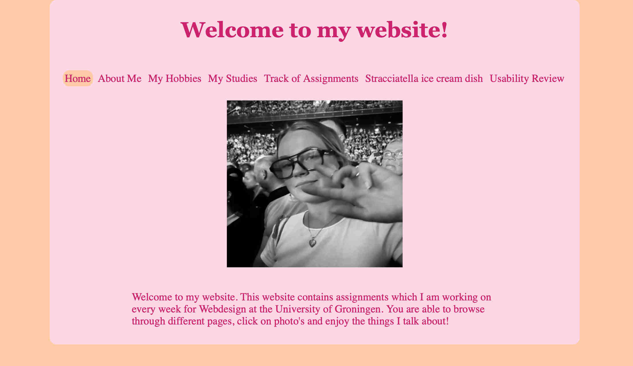
Laura's website feels fun and engaging at first glance. The color choices, both for the background and text, make the structure clear and the content easy to follow. The homepage is well-organized and straightforward, making it immediately clear what the website is about and its purpose.
Ease of Use & Navigation
The navigation bar is well-structured and consistent throughout the website which is great. There's a hover effect that changes the color of navigation items to make it kind of clear what is clickable. The active section is also marked, helping users to track their location within her site. The navigation bar contains a "Home" button which provides a quick and effortless way to return to the main page.
However, I think the navigation bar could stand out more. Adding a shape around it or using a different background color for that section could make it more visually distinct. Also, shortening the page names would allow for more spacing between words, improving readability and making navigation clearer and easier to use for viewers.
Readability
Laura's website gets straight to the point, avoiding unnecessary "happy talk" and keeping the content engaging and easy to understand especially on her "homepage" section.
Throughout the website, headings and titles are well-placed, clearly marking the most important parts of each page. The bolded headings help with readability, but increasing the font size or adding more line spacing could improve reading comfort.The paragraphs are structured well-not too short but also not overwhelming to read. I particularly liked the layout of the "Track of Assignments" page, where multiple headings with a consistent design make the page easy to follow.
However, using a different color for headings instead of the same text color would make sections stand out more, especially on text-heavy pages like "Stracciatella Ice Cream Dish". Having a more distinct contrast would break up the text and prevent it from feeling repetitive.
One thing I found really nice was how the first image on the "Stracciatella Ice Cream Dish" page was used-it immediately made the page more engaging.
Interactive Elements & Mobile Accessibility
All links and clickable elements are well-placed and easy to recognize. The fixed layout structure, and the width of the container and text makes the site mobile-friendly, which is a great usability feature.
Improvement
Overall, Laura's website is well-designed and structured effectively. However, a few small adjustments could enhance usability even further:
- Improve font readability by adjusting font size and increasing line spacing.
- Add more contrast for headings by using a different color than the regular text.
- Enhance the navigation bar by making it more visually distinct-adding a button-like effect would make it clearer that links are clickable.