Peer feedback
Feedback on Ruby's site
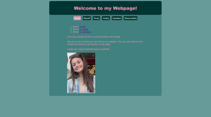
Is the site designed for scanning?Ruby's website is meant for scanning. There is not too much text that you don't know where to look. There is a clear difference between headers normal text. You can also see what is clickable, which is a purple color instead of pink, which is the rest of the text. There is no noise, everything is good and clear to see. This is probably also because there is a solid color as a background. What makes it less good for scanning is that there is no great contrast in terms of colors, and I also miss the use of H1 and H2 headings. This would make the website more visible and you don't necessarily have to read all the text to know what it is about.
Are the texts easy to scan?
The texts are easy to scan, because there are not too long paragraphs. However, the contrast between the background and the color of the text is not that big. Because of this, people could have a bit more trouble with reading quickly. This is especially true for the footer, which has a dark background color. Because of this, the dark purple link is not very readable. You could still improve this. Furthermore, the font is clear and also a good font size, which makes it easy to read!
Is there happy talk?
No, there is not much happy talk. She does not have a lot of introductory text on her home page, only things that really need to be on the site, which is good! There is some happy talk on the home page, for example 'I am very excited for this course and learn new things' and 'I hope you enjoy experiencing my website!'.
How user friendly is the navigation?
I find the navigation system of Ruby's website very user friendly. There is a good contrast between the colors, it is clear and easy to read. The navigation stands out and is in a clearly visible place on the pages. It is also clearly indicated on which page you are by the light pink color. The navigation is therefore prominently present, contains a link to the home page and is consistent.
Does the homepage clearly indicates what this site is about and what you can do at this site?
Yes, the homepage does clearly indicate what the site is about, but it could be a bit clearer. For example, the list has not been updated yet and you could perhaps indicate that you can click on the photo of yourself to go to the 'myself' page.
Other usability improvement suggestions
- Perhaps you could vary a bit more with H1 and H2 headings. This would make the page even more scan-friendly. You do this on your stracciatella page already, which is very good.
- You could look again to the contrats of the colours on your website. Adding more contrast in color, espcially in the headers and text, would make you website easier to read.
- When I open the site with CTRL-U, I often get an error message in the code with this piece: < /p >. This is especially the case on your 'updates' page. You should check this out!