- Homepage
- Navigation & Clickablity
- Scanability
- Design
- Recap of the review
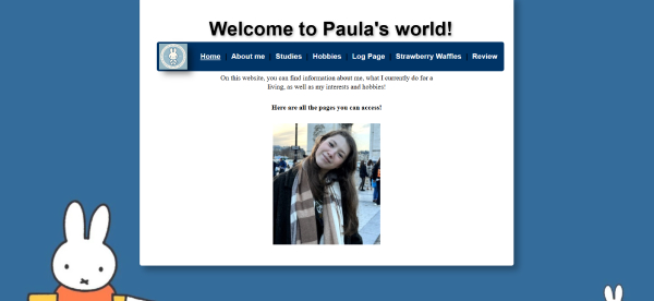
Homepage
The Homepage has a clear structure and the navigation is prominently placed on the homepage. The text on the homepage reveals the purpose of the website, which manages the expectation of visitors well and gives them insight in what kind of information they can read about. The bold sentence saying 'Here are all the pages you can access!' is slightly vague since it's unclear what is meant with 'Here'. It would be better to explicitly refer to the navigationbar above.
Navigation & Clickability
The navigation bar is functional and all the links work. It is clear that you're supposed to click on these words to gets to certain pages. The active menu item is not very clear indicated. I would recommend marking it by a difference in colour instead of underlining the active menu, since this is not immediately recognisable for visitors. Furthermore, the little logo in the left is a nice addition but I had the urge as visitor to click it, since it's on the navigation bar but this wasn't possible. A recommendation would be to link it to the homepage > as well. For clickability, it is not always indicated well that images are clickable. For example for the thumbnail picture and the picture on the "about me" page it is not clear that you can click it for more information.
Scannability
The use of lists and bold text is good for the scanability and let's people know which parts of the texts are more important. I would suggest to use more smaller headers in the text to draw peoples attention to the different topic discussed on the respective page, if there are for example multiple hobbies discussed. The website uses little happy talk and most of the information is very straight to the point. On every page the title of the page is above the navigation bar. These title are in the biggest font and there the most prominent one. However when clicking on the navigation bar, your eyes are drawn to the content below the navigation bar, which leads to not really seeing the title when scanning the page. A recommendation would be to put the header below the navigation .
Design
The blue, black and white of the design is good and gives a good contrast which makes all the text on the pages easy to read. The background having Miffy/Nijntje on it was however slightly distracting and let me to wonder why it was there because Miffy/Nijntje wasn't really mentioned anywhere. The background of the Strawberry waffles page being strawberries was more logical, since you as visitor don't have to wonder about the relation of the background to the content on the page. It did however break the consistency of the websites lay-out. Furthermore, the text and images are nicely centered in the middle of the pages.
Recap of the review
Positive points- Good use of design elements to create contrast
- Clear structuring of pages and navigation
- Limited amount of happy talk
- A more consistent and neutral background
- Improve active menu marker navigation bar
- Clarify and enhance clickability