- Is the most important term of each page also displayed as the most prominent one?
- Is it obvious what is clickable?
- To what extent is there distraction or design noise?
- Are the texts easy to scan?
- Do you see 'happy talk'?
- Is the navigation user friendly?
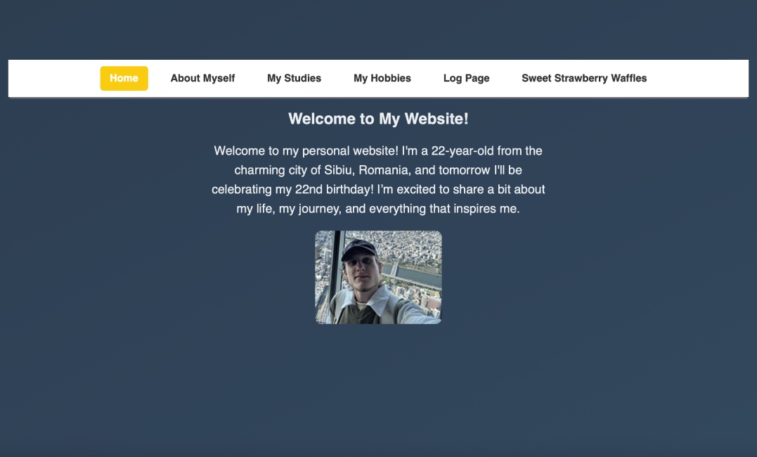
It appears that the heading and the main paragraphs are nearly the same size on every page. Even though the header is bolded, it still is not very easy to tell what the most important element of the page is. Perhaps this could be easily fixed by adjusting the text size of the header in the stylesheet!

As can be seen in this photo, it is very obvious what is clickable in the navigation bar, as the text is highlighted by the yellow block, which contrasts the color of the navigation bar as well as the background! Moreover, on the Strawberry Waffles page, it is obvious which part of the text in the paragraph is clickable, due to the fact that it is underlined and of a different color!
The style of the website appears to be minimalistic, so there are no obvious distractions, and it is overall pleasant. The background color, as well as the color of the text and navigation bar are consistent across every page, making it very easy to look at, and not overstimulating at all.
I think the text is relatively easy to scan, because of the size of it. The paragraphs are not too long, so they are easy to follow. However, it was mentioned that for the best scannability, the text should ideally be aligned to the left or justified, while the paragraphs here are all centered: this is definitely something that should be improved, so that it is clearer where the line starts and ends!
I am not too sure about this, but perhaps there is a little bit of happy talk present on the home page, more specifically the information about turning 22 the next day. Since his age was already mentioned in the very first sentence, this information might be a bit reduntant and filler-like. Otherwise, the other paragraphs are concise and include relevant information! :)
The navigation bar is placed in the center on top of all the content, appearing consistent on every page which is great for usability! Moreover, the color does not clash with the background, making it easy to see and access. Every page includes a "Home" button, making it easy to return and navigate between all the pages. Moreover, as mentioned before, there is a clear "You are here" indication on every page, which can be clearly seen on the navigation bar in the color yellow! The home page is also pretty clear in terms of what content we can expect, but also might be a little bit vague, because of words such as "my journey" which are not very specific (this might be reaching).
Overall, the website is very consistent and well-organized! However, perhaps there are spacing issues that need to be fixed. In my opinion, this site can benefit from having a general container div, where all the paragraphs and images can be put, to make the text stand out more!