Review of the website
Click on the image below to visit the reviewed website!
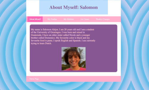
Scanning of the Website
I would say the site is not really designed for scanning. All the pages miss a heading. The only heading there is, is the navigation system. I would recommend to give each page a title as well. You can simply do this by adding a "top" div and make a h1 tag in this (dont forget to put it in the style sheet as well). It is obvious what is clickable! The navigation is clear and I really like the footer with "Home Page". But maybe also put a "homepage" in your navigation. Personally, I think the background figure is very distracting. The circles make me feel like you want to hypnotise me.
Scanning of the Text
The website is not having a lot of texts, so it is easy to scan. However, maybe you could make some words bold. For example, your name at "About Myself", and your studies at "My Studies". Further, you could say a bit more about your hobbies than only a small list of your hobbies. (The small list does make it easy to scan tho!)
'Happy Talk'
The website does not contain any happy talk. There are no headings on the pages, let a side a introductionary text. I think Salomon can improve a lot on happy talk.
Navigation
Really good navigation! I like the color combination and the class=on and hover functions work as well. The navigation is at the right place, good prominent location. Maybe add a "home" in the navigation as well. The class=on and hover are working at every page, love it. The navigation does not include a link to the homepage, like said before. This like is in the footer. So, I recommend to put it in the navigation as well to make it more user friendly. You do use hover, which makes clear at which page you are.
Homepage
I think the homepage can have a lot of improvement. It only contains the sentence 'Welcome to my homepage!'. I would recommend to put a picture here, a list of what you can find on this site, maybe mention the course. (Tip; take a look at others website for some inspiration ;))
Conclusion and Tips
Please make sure your fonts are supported by every browser!!! When I opened your webpage in Safari, it did not work!! Maybe change the background, just a simple color. But do whatever you like, it is your website at the end of the day! Put "Home" in the navigation. Use headings.