
Review
For week six I had to analyse a website of one of the other students. I analysed the website of Hector. There were several questions I had to answer to analyse the website. I have divided the analysis into four different themes: scanning, texts, navigation, homepage and usability.
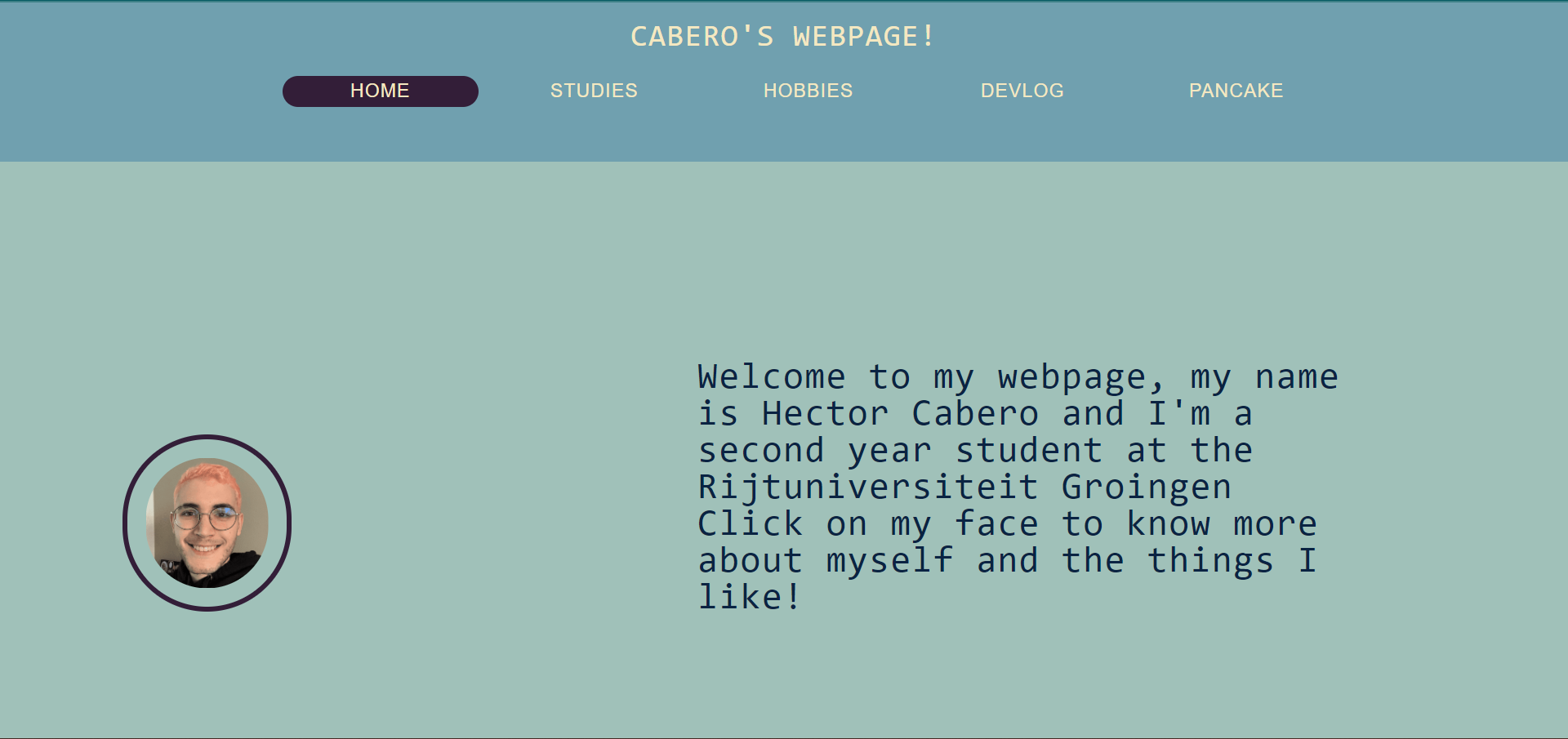
The homepage of the website
Scanning
The site has an effective visual hierarchy, the website is divided into two different parts by the use of different colours. In this way it is very easy for the user to see what the navigation bar is, and what the webpage is. One thing that is missing is that the most important term of each page is not displayed as the most prominent one. The webpages do not have a header of their own. There is a H1 header that returns on every page, but that is just the name of the website itself. The designer has made it very obvious which parts of the text are clickable by using a different colour and making the text underlined. I do not think there really is a big distraction on the website, there is a consistent use of colours and fonts, and as said before, the use of two different colours as a division between the menu and the body of the text is very nice. Something that also comes back on most pages is the circles surrounding the images, very clever! The only thing I can think of regarding design noise is the fact that the text is left-aligned on some pages, but centred on others.
The design has made it very obvious to see what is clickable in the text.
Texts
The texts on the different webpages are easy to scan. There is a coherent use of font and colour. The text of the website is straight to the point, there is no happy talk used on the website.
Navigation
The navigation on the website is very user friendly. The use of two different colours to make a division between the body and the menu makes it very clear where to look. Also the fact that the menu items change colour when you hover over it with your mouse, and the fact that an active menu item stays this colour (a very dark colour which really stands out from the background), makes the navigation very user friendly, a good you are here indication for the user. The navigation is also consistent throughout the entire website and includes a link to the homepage.
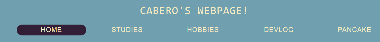
The menu on the website
Homepage
The homepage does not clearly indicate what the website is about. The homepage does clearly indicate what one can do on this website, due to the nice menu.
Usability Suggestions
Usability suggestions I would make for this website are making sure all the text is either centred or aligned to the left, and add headers for each individual web page. I do really like the circles around the images, so maybe put a circle-image on all pages? Another thing I would look at is the list on the page called studies , it is now right from the other text and does not read very nice, maybe put the list under the rest of the text as well? My final suggestion to improve usability would be changing the colour of the H1 header. I think right now it does not stand out that much from the very dark menu items, by also making the text dark and maybe even increasing the size, it would stand out much more.
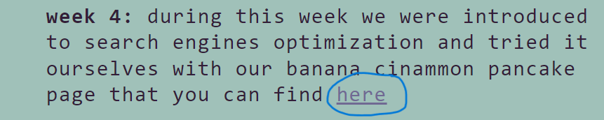
Click on the image of the pancake to see a recipe about banana cinnamon pancakes!