Let's review Jule's webpage!
I will review Jule's Website based on the following key aspects:
- Design & aesthetic appeal: Is the website visually pleasing? Are colors, fonts, and images well-chosen?
- Navigation & user-friendliness: Is it easy to navigate? Are clickable elements clear?
- Content clarity & purpose: Does each page effectively communicate its purpose? Can visitors quickly understand what the site is about?
- Scanning & readability: Is the content easy to scan? Are key terms prominent?
- Usability & functionality: Are there any distractions? How can the experience be improved?
First impressions
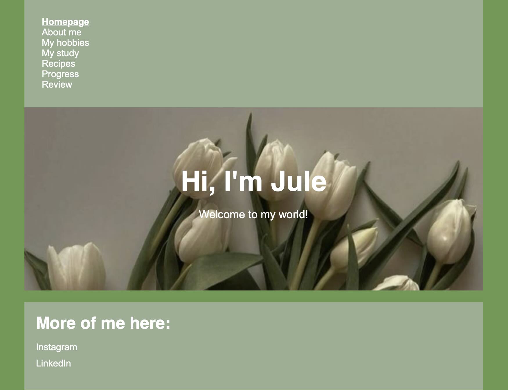
Jule's website has a calming and visually pleasing design. The green tones provide a neutral and peaceful atmosphere, and the tulip image on the homepage reinforces this sense of tranquility. The white text contrasts well against the green background, ensuring readability without causing strain on the eyes.
However, the homepage itself does not immediately communicate what the site is about. While "Hi, I'm Jule. Welcome to my world!" is a nice personal touch, it is the most prominent text on almost every page except "Recipes." This makes it harder to immediately grasp the purpose of each section. It would be more effective if each page displayed its specific title (e.g., "My Hobbies," "My Study") as the most prominent element rather than the general welcome message.
Here, you can see the frontpage of Jule's website:
Is the site designed for scanning?
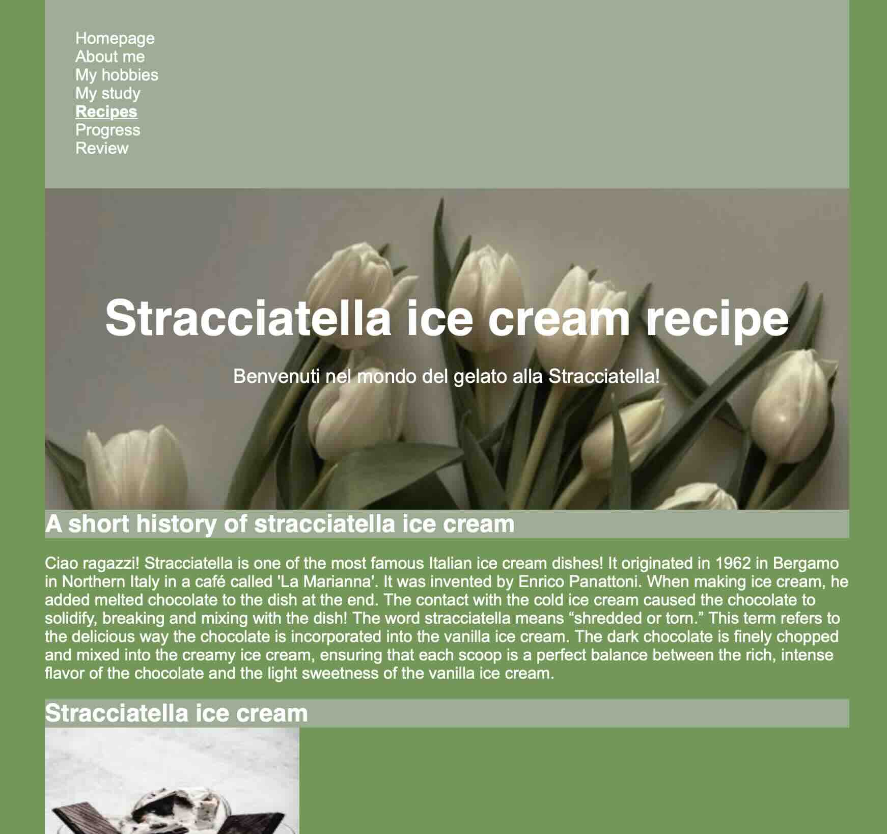
Jule's website has a fine structure for scanning. Pages like "Stracciatella Ice Cream Recipe" are well-organized with clear headings such as "History," "Recipe," and "Links," allowing users to quickly locate information. However, the other pages lack this level of organization, making it less scannable. Implementing distinct sections or summaries on the homepage would improve its scannability. In this picture you can see how the page on "Stracciatella Ice Cream Recipe" is organized. Here, you can see how this looks:
Currently, the recurring "Hi, I'm Jule. Welcome to my world!" message is the most prominent text across multiple pages. This repetition can overshadow individual page titles and content. Adjusting the design to feature each page's specific title prominently would provide clearer context and improve user orientation.
Clickability & navigation
Clickable elements are clear, with links changing color and becoming underlined on hover. However, navigation could be more user-friendly. A horizontal menu or sidebar with better visual separation from the content would improve clarity.
The navigation is consistent throughout the website, providing a stable and predictable user experience. This uniformity helps users understand the site's structure and locate information efficiently. The navigation menu includes a "Homepage" link, allowing users to return to the main page easily, which is an important aspect of good website navigation.
As mentioned earlier, the current navigation highlights the active page by bolding the corresponding menu item. While this provides some indication, employing additional visual cues, such as a different color or an underline, would enhance clarity regarding the user's current location within the site.
Distraction & design noise
The website maintains a clean and minimalist design, free from unnecessary distractions or design noise. This simplicity allows users to focus on the content without being sidetracked by crazy elements.
Readability & Happy Talk
The texts are generally easy to scan, especially on pages with clear headings and structured content, the content is direct and serves a clear purpose. The website avoids unnecessary "happy talk," presenting information succinctly and purposefully. This direct approach respects the user's time and enhances the overall user experience.
Homepage clarity
While visually appealing, the homepage does not clearly state the site's purpose or what users can do. A brief introduction explaining each section would enhance clarity for first-time visitors.
Final thoughts
Jule's website has a solid foundation with a clean design and good readability. Improving navigation, emphasizing page titles, and providing clearer homepage information would enhance usability. Overall, I liked Jule's website, it is a well-made site with minor areas for refinement.