Eva's Website
Review for Eva Vinke
This is a review on Eva Vinke's website. Click on the link or on the image to go there.
Is the most important term of each page also displayed as the most prominent one?
Yes, every page has a prominent term. That term is bigger than the rest of the text and has a colored border which stands out. That looks good. So the hierarchy is clear and consistent.
Is it obvious what is clickable?
A few links are clickable, which is obvious with the underlined line. And the things that are clickable are showing a different color when hovering over it. Only thing is that the colour of the clickable text is the same as the colour of the rest of the text. Which makes it stand out a little less. However, it looks more like a whole this way.
To what extent is there distraction or design noise?
The colour of the text is white, but because the background colour is also very light, it is a little difficult to read at times.
A similar thing is happening with the div-blocks, of which the color is very similar to the background so it doesn't really stand out.
Another thing I noticed is that the title of each page is quite big in proportion to the rest of the text, so it steals the attention.
When looking at the navigation bar, the only thing I'm missing is that the user can't see at what page they are. It could be useful if the page we are on is another color in the navigation bar.
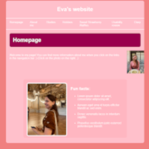
Last thing you could improve is to move your thumbnail-image on the Homepage a bit more to the left. Now it is all the way to the border of the website.
Are the texts easy to scan?
Yes. There is not (yet) that much text to scan, but it is easy to scan. Lists are used, which is easy to read. And there is space between different sentences/paragraphs which also helps. For the Waffle Recipe, it could maybe help to make some words/sentences bold or something. Because there is a lot of text, so if things are bold, that will guide my attention. Additionally, maybe some subheadings in longer pieces of text, that would help the scannability.
Do you see 'happy talk'?
Only at the Waffle Recipe there is some happy talk. However, that is a thing most recipes on the web do. But I think at the recipe, the instructions could be a bit shorter and more direct.
Is the navigation user friendly?
- Prominent: the location is good and obvious. In the center and in the top.
- Consistency: the navigation looks the same on every page, so it is consistent.
- Link to homepage: it does includes a link to the homepage on every other page.
- 'You are here' indication: it misses that. The user cannot see on which page they are when looking at the navigation.
Does the homepage clearly indicates what this site is about?
The homepage does shortly introduce what this website entails. But it is really short. It would be nice if it gave me a bit more info on what can be found on the website and maybe some hyperlinks in the text to directly navigate me.
What other usability improvements can you suggest?
I like the overall style of the website and the colour scheme. One thing I noticed which maybe does not really fit on a website, is the use of smileys (like ;)). It makes it look friendly, but also can be a bit distracting.
Another things is that you could maybe add some hyperlinks to the other pages on your website, to create a more guided website (which you did well with the Strawberry Waffles!).
In general I really like your website. The colors are nice and the way you used div blocks and images looks good. I especially like that they all have a similar border radius and are placed in the same line. Good job!