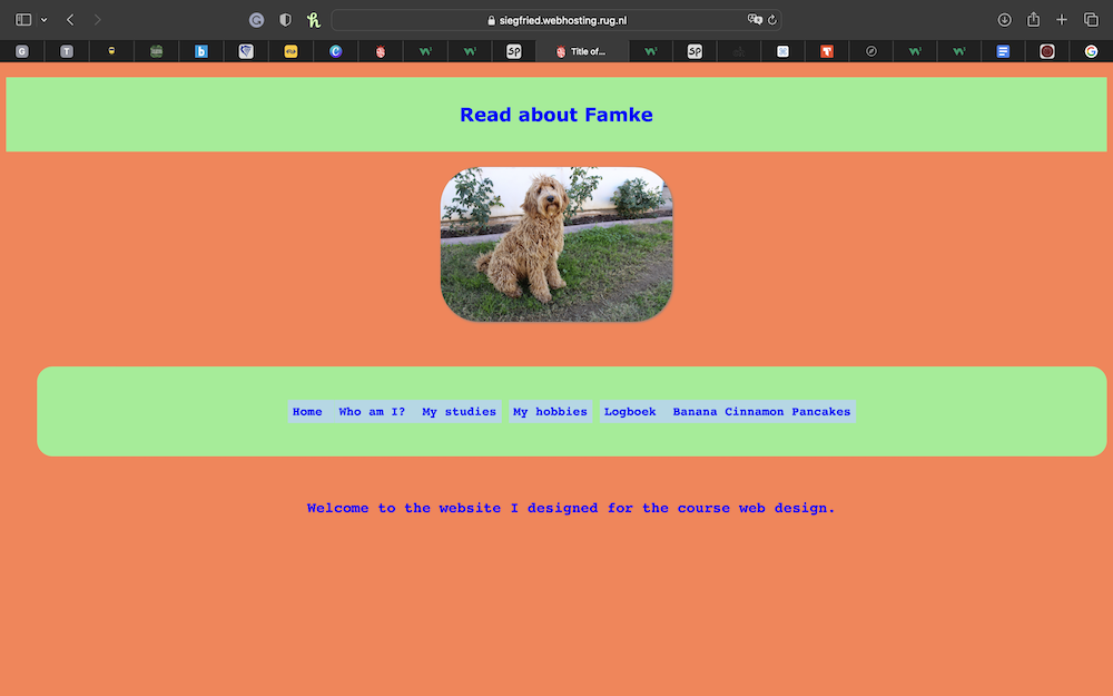
Having a first glance at Famkes website I immediatly was in a good mood due to the bright colors used and the cute dog picture!
There defiently is an effective visual hierachy created by bright colors such as orange, green and blue which really distinguish from one another making the site an eye-catcher for sure!
The most important term of each page is sort of displayed as the prominent one because even though the font is a bit bigger for the heading, it still has the same color as the rest of the text which is why it is maybe not as clear as it could be. Maybe another color and font would help to distinguish it a bit more.
It is definetly obvious what is clickable beacuse when you hover over the different links the background color or font color changes!
Even though I like the colors it might be a bit too much for some. The colors are very bright and the contrast very high which could be distracting or overwhelming for some users.
The texts are easy to scan and due to the contrast between background and font color very clear. There is also no use of "happy talk" since the sentences on the pages are rather short!
The navigation bar is user friendly and simple designed to not distract from the content of each site and since it is located at the top one can always see it. Furthermore, it is consistent on every page exept for the homepage which in my opinion is totally fine! Moreover, every page has the navigation bar on the top of the page in which the link to the homepage is embedded. However, there is no indication of where the user is on the site, which could be changed by adding where a .class active could help that changes the color of the page in the navigation bar.
The homepage states what the website is about since Famke included a little text about what the website is designed for. Due to the navigation bar the user gets a feeling of what is to expect when scrolling though the different pages of the website.
I really like the website Famke created but the navigation bar could be improved a bit because the border around some contens emerge into a big one instead of being spereate from each other. Also, I do not think that the image map is working and the image is also not included on the homepage.