Her review
Navigation & accessibility
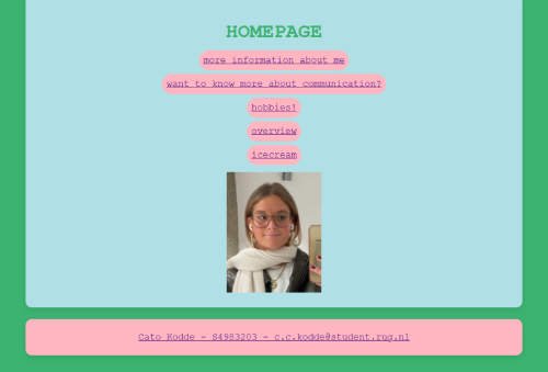
- The website is easy to navigate, but adding a Home button to the navigation bar would make it even more intuitive. Most users expect to find a quick way back to the homepage at the top of the page, rather than having to scroll down.
- Consider removing the underlining from hyperlinks in the navigation bar. It's a bit inconvenient for navigation menus. Using a different color or hover effect would maintain clarity while looking cleaner.
- There's currently no You Are Here indication when browsing different pages. Highlighting the active page or adding a different color would help users see their location at a glance.
Design & readability
- The blue link color could be adjusted to better fit the website's color scheme; a slightly darker or more neutral tone might integrate better.
- The colors used overall are really nice! They create a pleasant and visually appealing experience.
- On the About Me page, consider using bolded text to emphasize key points about yourself. This small change would improve readability and engagement.
- On the Hobbies page, instead of placing all three images side by side, consider stacking them vertically with subheadings for better organization and usability.
Content & scanability
- The website is scan-friendly, but mainly because there isn't a lot of text. Breaking up longer sections into lists, subheadings, or bolded keywords would improve readability.
- On the Stracciatella ice cream dish page, the text could be structured into smaller paragraphs, bullet points, or subheadings to improve usability. Large blocks of text can be overwhelming.
- The Stracciatella ice cream dish page is also missing a hyperlink where one is needed, and the image is missing. Adding these elements would enhance the page's completeness and usability.
- Our first assignment was to create a list, but currently, there are no lists on any of the pages. Adding a list somewhere would align the website with the original requirements.
- On the Hobbies page, turning the paragraph into a bullet-point list and bolding key terms (e.g. red wine) would make it much easier to scan.
Content labeling & clarity
- The "Communication" page title might be a bit confusing for new visitors. While it makes sense academically, renaming it to something like "Studies" or "Academic life" would make its purpose clearer.
- Having your name and student number on every page isn’t necessary; keeping it just on the homepage or in a footer would make the layout cleaner.
Positive aspects & final thoughts
- No unnecessary happy talk,the content is clear and to the point, which is great for usability!
- Overall, the website is functional and user-friendly, with just a few areas for improvement.
The most urgent fix would be adding a Home button to the navigation bar and ensuring the missing hyperlink and image on the Stracciatella ice cream dish page are included.
Keep up the great work!
