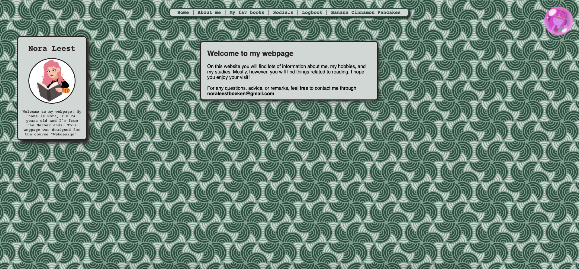
This usability review is for the website of Nora de Boer (S3238091). First off, I think this website is very well designed in general and also very good for scanning. There is a horizontal menu on top the website that provides clear navigation of the different pages. Below that you can find the content of the pages in div containers, so it is visually clear which part belongs where. So yes, there is a visual hierarchy. However, you can only see the menu on the homepage and not on the individual pages. There, you will only find a home button in the form of the house in the div container including information about Nora herself, which is the same on every of her pages. Each page has a clear header of what the page is about. Although on the page for Banana Cinnamon Pancakes, this header looks vastly different and falls out of the overall identitiy of the website. It is always obvious what you can click on and what not, since the navigation elements are at the same place and the home button is visually different, so the user knows he/she can click on it. The pages are easy to scan with clear paragraphs, some could have more text but overall this is also well done. As mentioned before, the header for the Banana Cinnamon Pancake page is quite different and the background image seems confusing. However, because this background image is so "noisy", the actual content elements stand in focus even more. The nature of the text is formal, professional and friendly, so there is no complaint about happy talk or any other style of writing. The navigation is very user friendly and prominently placed at the top of the page, but should be visible on all pages. Right now you can only see it on the homepage. The website overall is very consistent with minor exceptions. Also, every page has a link to the homepage (designed as a house itself). There is currently no "you are here" indication as the navigation menu is only visible on the homepage and on no other page. When you arrive on the homepage, you are greeted with what this page is about and this content div container stays present on each page so the user is reminded what this site is about in case he/she forgets. The homepage has a short text indicating what kind of information you can find on the website. The image map is on a page you can only access by clicking the picture on the top right. And while this picture visually stands out, it is not very clear that you can click on it. However, on that page then itself, there is a hint as text that you can click on the mouth, headphones and eyes to find out more. Overall, I really like this website and think that it is well done.