Reviewing Rikst's website
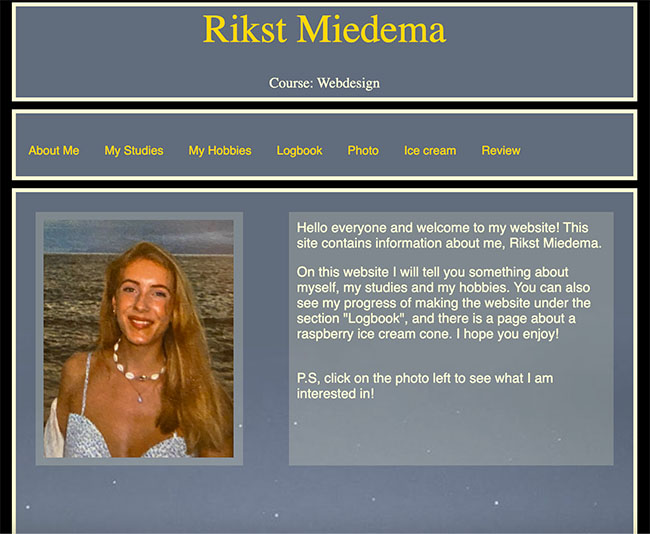
In regards to the design, I do enjoy the contrasting colours, makes it easy to read and the background image does not distract from the text, in fact it is quite pleasant to look at. The main header text should be more centred in the block. It is currently a little too high, centering this would help with the visual hierarchy, it's a little awkward currently as it is not centred.
In regards to the visual hierarchy, the picture is definitely what caught my eye first and then the text of the body. Had the header been centred I think that would change the visual hierarchy a little (personally because the header text was not centred, from my peripheral I found it off putting so it was last in my personal visual hierarchy). It is not very obvious what is clickable (except for the website that Rikst is reviewing), I would recommend for each link in the nav bar to have its own box and adding the hover function would make it more obvious what is clickable.
Additionally, it took me quite a long time to realise the text at the bottom of the page would take me back to the homepage so it is definitely not in a prominent location, I think this should be more obvious, for starters, adding that link to the nav bar would make it less confusing for users. It probably would have been fine if the text at the bottom was more obvious it was clickable.
I like that the blocks are symmetrical and that they are sheer as well, this adds to the soft aesthetic as solid blocks would have made it harsh. I would say it is user friendly for the most part, like I said above, the nav bar should be more obvious that it is clickable. One good thing though is that there is a clear "you are here" indication, except for the homepage since it is not on the navbar. The picture and text block on the "photo" section is not centred, which is not satisfying to look at so I would recommend for that to be centred.
The texts are easy to scan and neat, and the homepage clearly indicates what I can expect from this website. Some additional improvements I would add: I think the spacing of the text and the border of the block should be increased, in my opiniono it is currently too close and that does not make it look good. I would also change the text alignment from left alignment to justify because I think the justify text alignment looks better on small square blocks. Some texts are quite chunky as well so I would also add more spacing in between paragraphs.
There is a bit of 'happy talk', which is nice as it makes the page more fun,friendly and approachble. An example of this 'happy talk' is when Rikst says "I hope you enjoy!". The slight informal tone makes the reader seem like Rikst is a friend talking directly to us. Overall it is a relatively aesthetically pleasing and consistent website, with some minor tweaks it can be a really great one!