Usability review
The last one of the weekly assignments that we had to do for this course includes writing a web usability review for a website of a fellow student. In my case this happened to be the website of Jule Bellmann. This review was written on January 9th, 2023. Changes might have been made to the website since then.
Scannability of the website
There is an effective visual hierarchy. The navigation menu is clearly separated from the content section of a page. The most important term of each page is indicated with the use of an h-tag or by using a different colour to that of the main text.
It is clear what items on the website are clickable. The navigation menu implements a hover function and other hyper links are blue and underlined. In addition to this, if it is not naturally obvious if an item is clickable (e.g. an image map), a short text explains that.
All of the pages have a different colour background or background image (e.g. the "progress" page) and use different text colours or fonts (e.g. the "pancakes" page) which can be a distracting factor to some users as it is not consistent.
The texts are easy to scan as they are short and straight to the point. The website makes use of lists and headings which help with the scan-friendliness.
Happy talk?
I cannot see any use of happy talk on the website. The text that is used is informational and to the point.
Navigation bar
The navigation menu is user friendly. When a user hovers over the menu items, it is made very clear which item he is about to click on. The navigation is at the top of the page which makes it easy to find. The navigation does not include a link to the homepage. It also does not have an active menu item which shows users which page they are currently on.
Unfortunately, the menu is only visible on the homepage which makes navigating a bit harder when the user is on one of the other pages. Here, the user has the option go back to the homepage and visit another page from the navigation menu there. This is not very user friendly as it involves two clicks instead of just one.
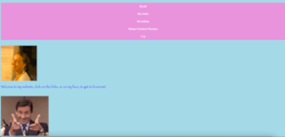
Homepage
The homepage includes a picture of the website's owner, a funny gif and a short welcome message adressing the users. It invites them to click on the items in the navigation menu to explore the website's content. It is quite clear what the website is about, but I would suggest writing another sentence so that it is more obvious. I would say that is not explicitly stated what a user can do on the website other than getting to know the owner. However, the presence of the navigation menu helps with figuring this out.
Improvement suggestions
- Add navigation menu (with a "home" link) to all pages
- Use a uniform background for all pages
- Make sure that the text colour(s) and fonts you implement are consistent