Review
Web usability review of Puck's website (reviewed on March 20, 2022, at 1:00 PM)
Web usability review of Puck's website (reviewed on March 20, 2022, at 1:00 PM)
Is the Site designed for scanning?
The first thing that caught my attention are the cute colors that are used for the website. They are very compatible and the design looks inviting, there is an effective visual hierarchy. The headers are clear and the titles on every page are prominent enough. It is also quite obvious what is clickable, since all the clickable links are marked pink. I also liked that not too much different colors on all of the pages, this is why in my opinion the website is not affected by design noise. I do have a few other remarks on the webpage. Some of the clickable links in do not work at this moment. The links in the navigation menu work fine and when clicking on it, you are directed to the right page. But almost every link in the content section do not work, which is a bit of a shame because I was curious what your pages contained! Also, the usability review is hard to find, I could only see it when I clicked on "Vesten" on the page about the business "El Patio", I think something went wrong there with the navigation. I think if Puck makes some small adjustments to some sections of her site, she has a really nice webpage!Are the texts easy to scan?
In my opinion, the texts are a bit hard to scan. The progress page and the raspberry ice cream cone page contain the most text. The use of white letters on a light-blue background are a bit problematic, and even though I do like the combination of those colors, it is quite hard to read. I would suggest making the background a bit darker or add some div blocks to your page. This could make the website more easy to scan and it's also nice for the lay-out!Do you see happy talk?
When I scanned through the pages of Puck's webpage, I did not notice a lot of happy talk (which is good). It makes the webpage more professional and convincing. There is a "Welcome" on some of the pages, but I like that because the webpage should still be inviting.Is the navigation user friendly?
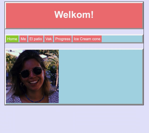
The navigation is in my opinion user friendly. The navigation menu is located at the top of the page in the middle, which is a prominent location. The pink color on the clickable sections in the navigation menu makes it even more clear. Also, the navigation bar is located on every page, thus it is consistent. Because the color changes of the page where you are, there is also a recognizable 'you are here' indicator. As said before, the usability review is hard to find, so this could be adjusted.Does the homepage clearly indicate what the site is about and what you can do at this site?
The homepage contains only a picture of Puck in the content section. Of course that is a hint that this site is about Puck, and when looking at the header and the navigation menu it also becomes clear it is a personal webpage. However, I would have preferred a bit of text (not too much happy talk of course), just some sort of introduction of the website and what you can expect when visiting it.