Review
I reviewed the website made by Claudia Gomes, as the site directly below mine is marked with a sad smiley.
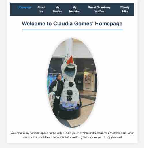
Claudia's website is very clear and easy to navigate because of the simple but aesthetically pleasing layout and colors used. The layout is consistent on all pages and there are pictures to further illustrate the text. The homepage states the goal of the website and what all there is to explore. The text is easy to scan because it is well organised through the use of headings in the text. There are no distractions and design noise on the website. The most important terms of all pages are mostly displayed as the most prominent ones. It is clear what each page is about when reading the title on the top of the page. For example, the homepage says 'welcome to claudia gomes' homepage'.
Navigation
The navigation menu is done well with effects when hovering over the different pages. It is also indicated which page you are currently on through highlights in the navigation bar. This works for all the pages except for the My studies, My hobbies and Weekly edits pages, so a tiny adjustment is needed to fix those.
Clickability
The pictures on the website have hover effects, but only some of them are clickable and have a link. This might cause confusion whether pictures have links or not. So it might be better to make the pictures without links non-clickable. The links in the image map on the second page work, however the links for the eyes and ears are not in the right place.
Happy talk
The text is free of happy talk, all content is relevant to the website.
Further improvements
The picture about Swansea University is not visible so an adjustment is needed to fix this.
The images and text on the My hobbies page are not the same in size and alignment. By making them align consistently, this can be fixed.