Usability Review
Usability Review: Janneke's Website
This is a review of my peer Janneke's website, where I will look at the usability of her website and add where I think there is room for improvement.
First Look
Janneke's website is very neat and effectively optimizes many areas for usability. With the use of clear contrasting colors, blue, grey, and white, with a black font, the text is easy to read. Her navigation bar is clear and accessible at the very top of every page, with obvious spaces in between and simple short names. It is evident from her navigation bar which page we are on, because the background of the page name is colored black, while the others are white. The style of the website is very consistent across all her pages, eliminating design noise that may confuse visitors. There is little use of happy talk, rather it is straight to the point and each page clearly displays the most important terms.
Constructive feedback
My main critique for her website would be that her content div used on all her sites is set to 545px, making it appear very small on a laptop screen, and the text sections appear very compact, which is not inviting to read. I enjoy the font she uses for her title and main header, however she uses three different fonts on every page that are conflicting in style and can be considered design noise.
I will now go more in-depth of certain pages where I see strong-points and room for improvement.
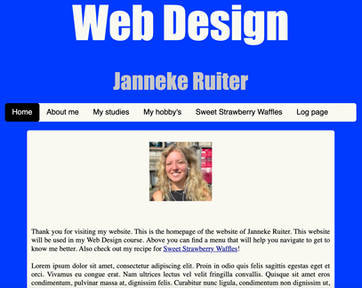
The Homepage
Her homepage makes it clear what the website is about. In the future she might have time to replace the 'Lorem ipsum' text with real text, as it now appears unfinished. What I find nice about her homepage is that it includes a reference and clickable external link to her 'sweet strawberry waffles' page and when you hover over it, the link becomes pink, indicating that something will happen when you click on it.
About Me
I enjoy that she includes external links inside the text about herself, making the experience more fun and interactive. It is clear that they are clickable links, as they have the standard look of being underscored and in blue, which is widely recognized as a clickable link. Even more clear is her use of 'if you want to know more... click here', and the 'here' is the clickable link. Further the text looks very compact, despite the use of paragraphs. She could make it more inviting to read by using subheadings or insert images to create a natural break in the text.
Hobby's
Hobby's is the Dutch spelling and it should be 'hobbies' in English. Spelling errors could be confusing for visitors, although in this instance it is evident what she means.
I like her use of headings for her different hobbies and the fact that she used two divs, to introduce the topic of hobbies and to include the full list of her hobbies. To make it more interesting and personal for visitors she could add images of her hobbies.
Conclusion
Janneke's website does a good job optimizing usability. With little design noise and happy talk, each page is straight to the point with a clear purpose. My main suggestion of improvement would be to make her content div 800px wide and not 545px, as this only needs to apply to the text. She may also consider sticking to one font or a consistent font style, rather than using three conflicting styles.
Back to Homepage