
The website i reviewed is the website made by Brecht de Vries.
Design
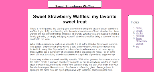
The title of the page, which is the most important. Is the largest text on the page. This is the case on all pages except the sweet strawberry waffles page. On that page, the title of the content is larger than the title of the page. Besides that it is very clear which links are clickable. This is because the links are blue and there is a line under the text.
The page is very minimalistic, except for the page of sweet strawberry waffles. On the page there is a header that is very big in size. This distracts the user from the real title of the page. Besides that, the titles on some pages are not completely inside the white box. In addition, the titles of the pages do not all have the same front-weight. Some are normal and some are bold. This can cause a distraction, and that the attention of the content.
Text
The text is easy to scan. This is because, lists that have been used. But not only that, the paragraphs are not too long. Therefore it are not chucks of text that people have to read. Headers have been added on the log page, but not on the other page. This way you do not know what you are going to read about. You have to read everything in order to understand. I do not see any happy talk on the website. The sentences are short and have useful information.
User friendly
The navigation is positioned on the right of the screen, in a separate block. This location is the same on every page. So, if you go to another page, the navigation remains the same. It would be better if the navigation was on the left side or at the top of the screen. The navigation has a link to go back to the homepage. The link is called home.
The links of the pages are in a list. The order of the pages in the navigation does not change, when going to another page. It does not show when you are on a specific page. There is no colour block around the text, and the text does not become a different colour. These things would indicate where you are. But these parts are not there.
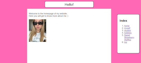
Homepage
There is not a lot of text on the homepage, but it clearly states that you will learn something about her. But you do not know what you are going to learn about her. So, it could be anything. You can only find out by looking at the links in the navigation.
Usability improvements
I would suggest placing the navigation on the left side of the page or under the title of the page. It would be nicer if it was placed under the title. Because this way people do not have to search for the navigation. The reason for this is that often the first thing people look at is the top of the page. I would also suggest removing the title of the navigation. The title that is used is index. I do not think that a title is needed for the navigation.