Review of Elizabeth's Website
This review focuses on the usability of Elizabeth's website. The website introduces visitors to Elizabeth's life through various sections such as "Home," "Myself," "Studies," etc. In this review I will evaluate the site based on its clarity, interactivity, navigation, design noise, and overall user-friendliness.

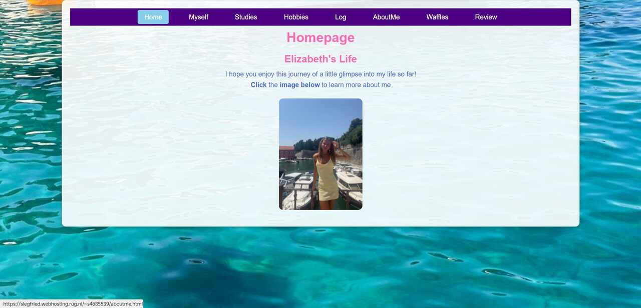
The most prominent heading on each page is same with the active tab, such in Home, you see the "Homepage" inside h1 tag. I would prefer a more engaging phrase like "Welcome to Elizabeth's World", but since the headings are clear, and homepage gives context in the following text, about the site's purpose.
The navigation bar is very clear, efficient, user-friendly, and consistent since it is located at the very top of the page, which is the expected location for users. The navigation bar is labeled with all accessible pages. Clickable elements are easily distinguishable with the help of pink (while hovering) and blue (on active tab) colors. Also, it is stated that the image thumbnail is also clickable, with a clear call-to-action text emphasized in bold "Click" and "image below" . Also, the navigation menu includes a link to the homepage under the "Home" tab. This provides users with usability and ensures users to return to the starting point easily.
The site maintains a clean and minimalistic layout. However, some elements could be improved to provide better structure. For example, the very sharp and colorful picture of a blue pool is used as the background. This picture can be softened by reducing its opacity and color brightness or completely changed with a new solid pastel colored background. There is no excessive clutter or unnecessary graphics, which is excellent. The container which holds the main content currently has a reduced opacity, it can be reconsidered for a better readability of the content. By introducing these changes the site can feel more polished without "design noise." The texts on the home page are very short and easily readable.
There is not much "happy talk" and it is not leading to distraction. For example, the sentence: "I hope you enjoy this journey of a little glimpse into my life so far!" can be considered as an example of "happy talk," which adds a friendly tone. I think it does not have to be replaced.
While Elizabeth's website is already well-designed and user-friendly, there are several areas where usability can be further improved:
Visual Hierarchy: The headings on the homepage could be made more prominent to help guide users through the content. A larger and more visually distinct heading could improve the overall flow of the page and make it easier for users to navigate.
Background Enhancements: The background, which is sharp and blue in the pool area, could be softened down or changed to a more neutral, pastel-colored background to improve readability. This would also give a cohesive feel to the website, instead of jarring visual cues.
Improved Contrast: Increase opacity on the content container for better text contrast, allowing readability. This would definitely be a help for those with visual impairments to study the content more accessibly.
Overall, Elizabeth's website is well-designed, user-friendly, and accessible. Navigation is clear, and clickable elements are easy to identify; hence, the site is easy to use. The minimalistic layout is effective in reducing distractions, while the content is simple and straightforward. Elizabeth's website has a clean layout, making navigation easy with minimal distractions. Clickable elements, such as navigation links and the image, are very usable. Certain visual preference improvements can work toward enhancing its usability. A little bit more consideration to readability, accessibility, and design structure will bring about a much better experience on the site. All in all, this has got a strong foundation, and with time, this site could really be improved upon.
