Website Review for Dengxiang Hu
Is the site designed for scanning?
The site is organized well, with big headings that help users understand each page. But, some sections (like 'My Study' and 'My Hobby') have long paragraphs, which makes them harder to read quickly.
- Is the most important term of each page also displayed as the most prominent one? Yes, each page has a big, bold title that clearly shows what the page is about. This is good because users can quickly understand where they are.
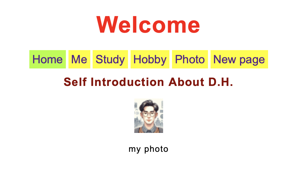
- Is it obvious what is clickable? The navigation buttons stand out because they have different background colors. However, it is not really obvious how the page with the photo can be navigated. It would be useful to include a phrase like: ' Click on different parts of the image to explore my interests'.
- To what extent is there distraction or design noise? The site uses a lot of bright colours - red, brown, yellow and green. This makes it look lively but also a bit messy. Using just one or two main colors would make it look cleaner and more coherent.
Are the texts easy to scan?
Not always. The long paragraphs in some sections make it hard to find key information. Adding more spacing, bullet points, or bolded words would help users find what they need faster.
Do you see 'happy talk'?
Yes, the site uses friendly and welcoming language, especially in the 'Me' and 'Hobby' sections.
How friendly is the navigation?
- Is it at a prominent location? Yes, it's at the top of every page, which is very good and it makes it easy to locate.
- Is it consistent? Yes, it appears on all pages at the same location.
- Does it include a link to the homepage? Yes, there is a 'Home' button, ensuring users can return to the main page easily.
- Is there a 'you are here' indication? Yes, the button for the page you are on turns green, which helps users know where they are.
Does the homepage clearly indicates what this site is about and what you can do at this site?
Not really. The homepage says 'Welcome' but it doesn't explain what the site is for. Adding a short sentence, like 'This site is about me and my experiences' would help users understand it faster.
What other usability improvements can you suggest?
Right now, the website is pretty user-friendly. However, the only important mistake that I have noticed is that there is a 'New page' button in the navigation menu which doesn't seem to do anything and therefore it could be confusing for the readers.