Usabillity review
The site I will analyse from the point of view of usability is that of Arianna Bambagioni (S5522773) because the one immediately below me in the list is marked with a sad face. Therefore, the titles on all pages are well highlighted by their size, but the white colour does not contrast with a light background and is harder to read, also the titles are not written in capital letters, those being two aspects that I would improve. Buttons and links are clearly identifiable with hover effects and contrasting colours both in the form of a menu and as in-text links, but as an improvement I would indicate through text (ex: Click here) that the portrait present on the homepage links to the author's about page.
The choice of pink and turquoise colours in very bright shades combines beautifully but becomes quite tiring when browsing. The text blocks are green so there are far too many colours on the page at the same time. The titles are white and hard to read and the small text is black so the 5 colours on the page become quite disruptive. Also, in terms of appearance, I would have liked the menu to be centred like the rest of the elements on the website, for a more uniform look, but this is functional and intuitive, also emphasizing the page you are on.
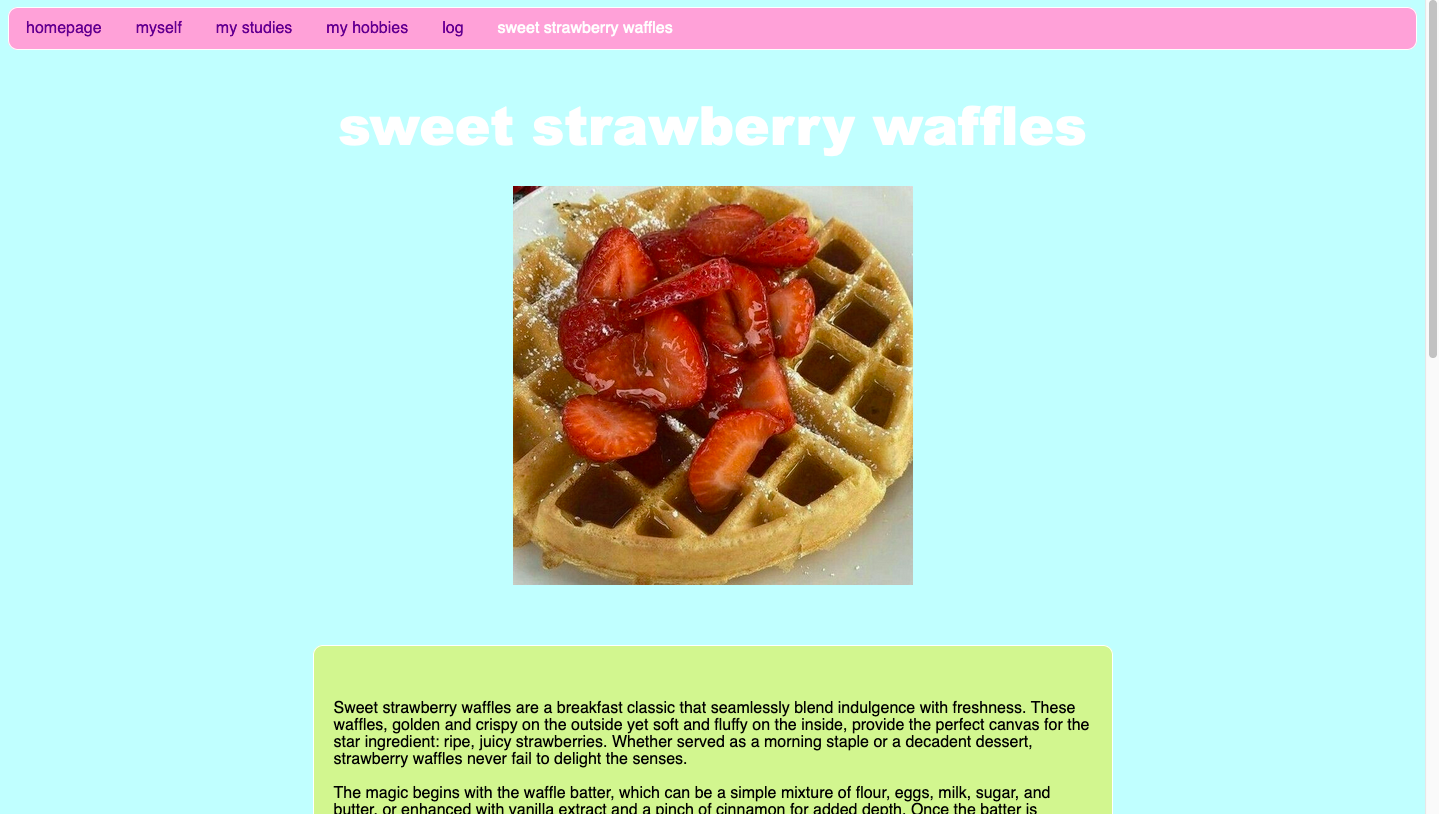
I like the content of the text, its kept short simple and conclusive making it very easy to skim through. Furthermore, I would have included a text box on the homepage to fill the page in a uniform manner with the other pages but also to provide more context for the existence of the site. I do not identify forms of "happy talk" or exaggeration, which gives the website a feeling of approachability and honesty. The images used are qualitative and beautifully placed on the page, I do not see any design or functionality errors apart from a single image missing from the hobbies page. The image map works perfectly and is ideally set on the portions of the page.
In conclusion, navigation is intuitive and consistent across all pages, which improves the user experience. The use of mouse click effects and clear text links shows attention to detail and ensures that users can easily interact with the site. In addition, concise and well-structured text allows visitors to quickly find and understand the information presented, making the site very user-friendly.
However, there are areas for improvement that could raise the design to an even higher standard. Improving the colour contrast of the titles and text would greatly improve readability, especially for users who may struggle with visual accessibility. Reducing the number of bright colours used on the site and centring the menu for a more balanced aesthetic would also make the design feel more cohesive. Overall, the website is both functional and visually appealing, with a clear focus on usability. Implementing these suggestions would make the site even more refined and accessible, while maintaining an approachable and honest tone.
Click here to access the reviewed website