Review!
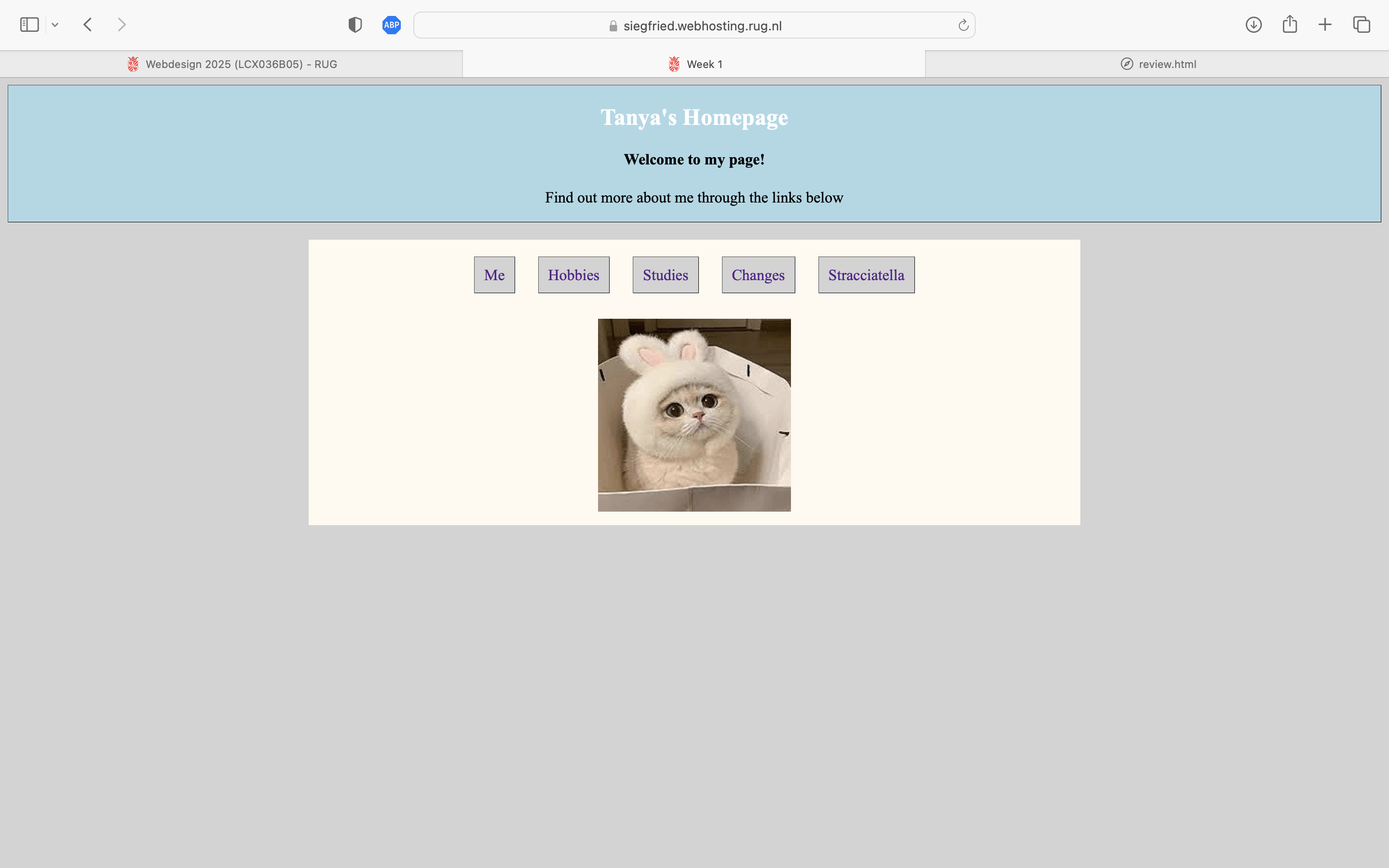
This review will discuss Tanya Vinogradova's site. I'm evaluating her oeuvre based on the Web usability, this will be assessed by answering a set of question.

Is the site designed for scanning?
Yes, the site is easy to scan. The homepage is simple, with a short welcome message and clear navigation links. This makes it easy for users to quickly find what they need without too much effort. The use of space between elements helps guide the eye. Adding bold headings or bullet points could make it even easier to scan.
Is the most important term of each page also displayed as the most prominent one?
The homepage title, "Tanya's Homepage," is clear and easy to see, so visitors immediately know whose site it is. However, since we can't see the other pages, it's unclear if they follow the same approach. Ideally, every page should have a clear heading that tells users what it's about right away.
Is it obvious what is clickable?
Yes, the links are easy to spot because they are underlined, which is a common way to show clickable text. This makes it clear what users can click on. If the site has buttons or images that work as links, they should have some kind of visual clue, like a hover effect or a different color, to make sure people know they're clickable.
To what extent is there distraction or design noise?
There isn't much distraction or unnecessary design on the site. The layout is clean and keeps the focus on the content. There are no flashy animations, pop-ups, or extra elements that might confuse or overwhelm visitors. This simple design makes it easy to use.
Are the texts easy to scan?
Yes, the text is short and to the point. The welcome message is brief, and the navigation links are well-labeled. However, using bold text or headings could make it even easier to skim through the content quickly.
Do you see 'happy talk'?
Yes, there is a little bit of happy talk, like the phrase "Welcome to my page!" While it's friendly, it doesn't add much useful information. Instead, the site could have a short introduction that clearly explains what it's about.
How friendly is the navigation?
The navigation is easy to find and use. The links are in a good spot and are clear. However, it's not clear if the navigation stays the same on all pages. Keeping it consistent across the site would make things easier for visitors. Also, having a way to highlight the current page would help people know where they are. If there isn't a link back to the homepage on all pages, adding one would be helpful.
Does the homepage clearly indicate what this site is about and what you can do at this site?
The homepage gives a general idea by showing the owner's name and linking to different sections. However, it would be even clearer with a short description that says what visitors can do on the site, like "Check out my projects, learn more about me, and get in touch."
What other usability improvements can you suggest?
Making sure every page has a clear link back to the homepage would help with navigation. Adding a small highlight or marker to show what page a user is on would make it easier to find their way around. Keeping the navigation the same on every page would prevent confusion. Making the site work well on mobile devices would help people use it on different screens. Adding descriptions to images and improving text contrast would make it easier for everyone to read and use the site. Finally, using bigger or bolder headings could help organize information better and make it even easier to scan.

