Eva's website
Usability review
Important terms
The most important term of each page is also displayed as the most prominent one. For example, the title of each page is placed at the top of every page.
Design
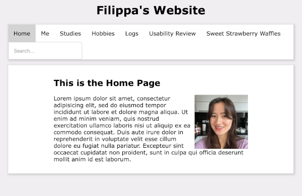
It is obvious what is clickable. For example, the navigation is in a box and when you hover over it it changes colour. It also changes colour when you click on it, which creates a 'you are here' indication. It is at a prominent location at the top of the page, and it is consistent on every page. Also, it includes a link to the homepage. Therefore, the navigation is user friendly. However, some clickable features are less clear that they are clickable. For instance, the image on the homepage. Additionally, there is no distraction or design noise. Everything looks very clean and is neatly organised in boxes. Moreover, the texts are easy to scan, because every paragraph is structured and there are clear titles. There is also no happy talk.
Homepage
The text on the homepage does not clearly indicate what this site is about. There is still 'lorum ipsum' text. So, it does not explain what the site is about. However, it is clearly stated that it is her page, because it says so in the title of the page, and you can see it in the navigation bar.
Improvements
Besides the things I have lised before, there are no usability improvements that I want to suggest. If you are insterested in Filippa's page, you can find it here.