Review of Messi's Fan Club
Click on the image to be redirected to Messi's Fan Club.
Is the most important term of each page also displayed as the most prominent one?
Yes, each page (with the exception of Sweet Strawberry Waffles) has a h2 heading with the title of the page. While it is easy to understand what page you are on, I think putting the most important term as a h1 heading is better in order to follow the hierarchy of headings. I did not notice any h1 headings on the page.
While the Waffles page does not have a title to it, it is clear what the page is about. I would still add a h1 heading Sweet Strawberry Waffles, as there is no h1 heading on this page either. Putting Sweet Strawberry Waffles as h1 could help with SEO as well.
Is it obvious what is clickable?
Mostly. The navigation bar has nicely designed buttons which are obvious clickable buttons. However the image map logo that redirects to the image map, as well as the actual image map do not have any indication that these pictures are clickable (and where exactly on the picture I can click). If I did not know that this was part of the assignment, as a user, I would probably not figure out that these are clickable.
To what extent is there distraction or design noise?
I would say that the design is pretty clean and nice. The only nitpick that I would have is that there are a lot of (in my opinion) unnecessary white lines. For example, on the Studies page, each study is separated by a white line that spans across the entire webpage. I think this is unnecessary.
Are the texts easy to scan?
As mentioned in the previous question, the white lines can make it difficult to read, however there is not a lot of text in general on the pages, therefore I will refer to the Waffles page for this question.
The text is center-aligned, which makes it difficult to follow as the lines are all different lengths. There is very little bold or italicized text, which would help identify which parts are important and which are not.
The ordered numbered list in the How to Make Sweet Strawberry Waffles has the numbers quite far away from the actual text, which also makes it difficult to scan. The white lines under each unordered list item makes it difficult to scan.
Do you see 'happy talk'?
There are 1-2 sentences of happy talk on the Waffles page which does not cause any problems. If anything, it serves as a nice, short and clear introduction to the page.
Is the navigation user friendly?
Yes. The navigation bar at the top right is very easy to use. It works just as one would expect.
Is it at a prominent location?
Yes. It is at the same location on every page - top right, which is hard to miss.
Is it consistent?
Yes. Each page has the same navigation bar.
Does it include a link to the homepage?
Yes, there is a Home button that redirects the user back to index.html.
Is there a 'you are here' indication?
Yes. It is easy to tell which page the user is on thanks to the active button on each page which is in a pink color, compared to the dark blue button on inactive buttons.
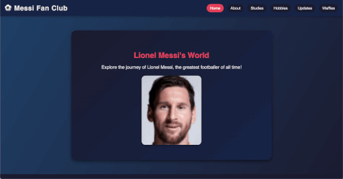
Does the homepage clearly indicate what this site is about?
Yes. There is one clear statement about what the page is about on the homepage. It is about Messi, “the greatest footballer of all time”.
What other usability improvements can you suggest?
I would make all images that are orientated as a portrait smaller, because the user cannot see the entire image without scrolling.
I would change the link text color to something more contrasting, as it clashes a little bit with the dark blue background of the page.
I would use more heading styles than just h2 to give the page more structure which would also make it more readable.
I would also make the container size 800px so it fits on other screen sizes.