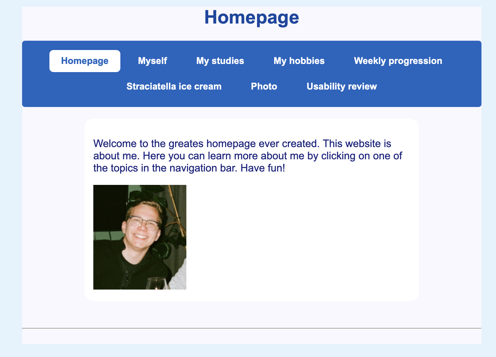
FEEDBACK
NAVIGATION AND ACCESIBILITY
The navigation is clear and highlighted because of the blue color! The 'you are here' is made clear because of the white box it is in.
you could add a 'back to homepage' link at the bottom of each page for when a page is large (like weekly progression), to make it easier to go back!
The navigation is clear and highlighted because of the blue color! The 'you are here' is made clear because of the white box it is in.
you could add a 'back to homepage' link at the bottom of each page for when a page is large (like weekly progression), to make it easier to go back!
DESIGN AND READABILITY
The design is clean and structured, making it easy to navigate. The white background with blue accents provides a professional and clear visual hierarchy. However, consider softening the contrast slightly—for example, by using a slightly lighter shade of blue for the navigation bar or a soft shadow effect to reduce stark transitions.
The page title ("Homepage") is well-positioned, but a larger font size or bold weight could make it stand out even more.
The navigation text is small compared to the buttons, which creates a slight imbalance. Consider making the text slightly larger!
SCANABILITY AND CONTENT
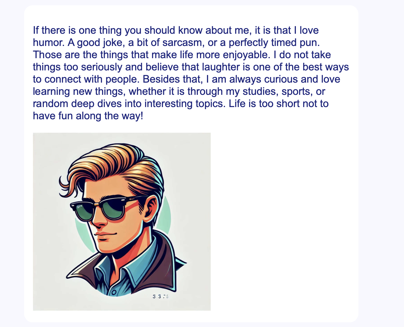
The text is engaging and personal, making it enjoyable to read. It provides a strong sense of personality and enthusiasm, which is great for a personal website.
However, both sections contain long paragraphs, which can make scanning difficult. Breaking the text into shorter, more digestible chunks would improve readability.
The font size is clear and readable, but the line spacing could be increased slightly for better readability.
Consider using bullet points or bold keywords to highlight key aspects of each section. This would help readers quickly grasp the main points without reading everything in detail.
FINAL POSITIVE THOUGHTS
This website does a great job of creating a personal and engaging experience for visitors. The content is well-written, full of personality, and provides a clear sense of who the author is, making it easy to connect with. The navigation is intuitive, and the color scheme is clean and professional, ensuring good readability. The mix of text and visuals is well-balanced, and the inclusion of the University of Groningen logo adds a nice touch of credibility. The homepage and individual sections successfully introduce the topics in a way that keeps visitors interested. Overall, this site has a strong foundation with great content and structure, making it an enjoyable experience for users.
This website does a great job of creating a personal and engaging experience for visitors. The content is well-written, full of personality, and provides a clear sense of who the author is, making it easy to connect with. The navigation is intuitive, and the color scheme is clean and professional, ensuring good readability. The mix of text and visuals is well-balanced, and the inclusion of the University of Groningen logo adds a nice touch of credibility. The homepage and individual sections successfully introduce the topics in a way that keeps visitors interested. Overall, this site has a strong foundation with great content and structure, making it an enjoyable experience for users.
LAST TIPS
Go back to the homepage
- Improve scanability by breaking up long paragraphs into shorter, digestible sections.
- Add subheadings to better structure the content and make topics easier to find.
- Use bold text or bullet points to highlight key information for quick reading.
- Adjust line spacing and margins for improved readability and a more balanced layout.
- Refine the active navigation indicator to make it clearer which page the user is on.
- Ensure consistent styling across all elements, including text alignment and image placement.
Go back to the homepage
