Review
Firstly, the color scheme is very nice. Visually, there is not too much going on, but there is enough going on to want to keep reading. The background color matches well with the white and dark red elements, it is pleasing to the eye. The font is nice, and easy to read. The use of subheadings divides the texts well.
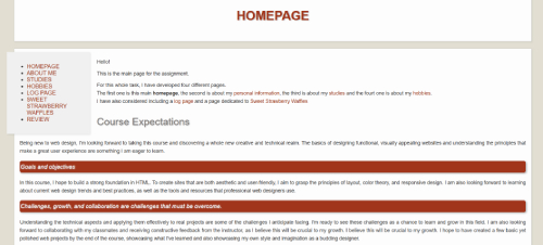
On the homepage, it is immediately made clear what the site is about. I like that every page is immediately visible in the list of links. Also, the use of red headings and subheadings makes the page very readable and easy to scan.
The thumbnail is there and it works well, but I would suggest a small mention that it is clickable . Apart from that, everything else that is clickable is very clearly clickable. The dark red color is the same as the headings and subheadings, which indicates that it is important, so that is great!
When clicking and reading through the pages, the navigation bar at the top is consistent throughout every page , with a red block highlighting on which page the user currently is. The bar is located prominently at the top of the page, where it is easy to find, with the exception of the home page, but I will discuss this in a second. It includes links to every page, including the home page. Overall, the navigation is quite easy and user friendly. There is a small error in the navigation bar though. When I am on the Log, Sweet Strawberry Waffles, or Review page, I am not able to click the About Me page. Also, on the home page, the navigation menu is different from all the other pages. This is not bad, per se, but the addition of the Sweet Strawberry Waffles text, which is quite long, makes the menu look a little bit cluttered. I would suggest maybe adding the same navigation bar to the homepage as on the other pages, to make sure that everything is consistently user-friendly.
Most of the text on the pages is easy to scan. The texts are not too long and there is little to no filler information. There is no happy talk, and the text is formatted nicely, though some words could be bolded to add some emphasis. Photos are also well formatted, with a neat border around them. I really like that some videos were included, these make the text even more interesting to read.
If I had to make some small suggestions , I would add a mention that the thumbnail is clickable. Additionally, I would make sure that the navigation bar is consistent throughout every page, including the home page. I like that the home page has a slightly different design and lay-out, but for user-friendliness it might be better to make the navigation the same everywhere. Lastly, I would make sure to fix the fact that the About Me page is not clickable from every page on the site. Apart from that, I think this website is very well designed. It looks great and it is easy to read and navigate!