Review
In week six, we were supposed to create a web usability review of the website of another student. I was supposed to analyse the website of Lea. There were several questions we had to answer to analyse the website.
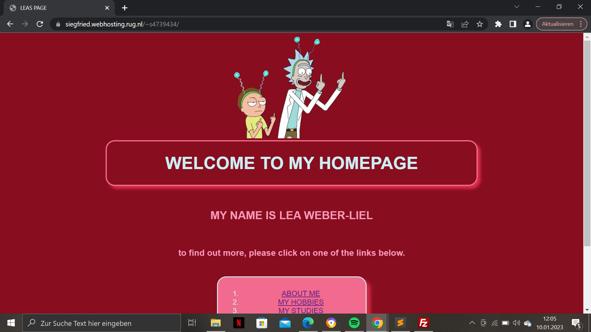
When opening the website, it immediately caught my attention, due to the colours being very bright and the theme being fun.
Visual hirachy: The webiste has an effective visual hirachy, due to the colours and blocks used. Using red and pink together makes them similiar to one another while still being so different, that they stand out.
The most important term is prominent. That is due to it being the biggest text on top of the page, and not within the blocks Lea used.
You can see what is clickable by hovering over the website, although there is no indicator that you can click on the icon image of her to find out more. This would have been nice to know, so the visitor does not have to hover over every part of the website.
I personally like the colors but I can also see that they can be overwhelming for someone and they do not want to spend as much time on the website
Scanning of the text I think it is a bit exhausting to read the white text in the pink block and I might have used a different font colour or a background colour that is a bit more calm.
The Navigation is not that user friendly, because there is no fixed navigation bar. If you want to go to a different page you have to go back to the homepage every time. Lea gave the viewer the possibility to just click on a "back to homepage" link instead of having to use the back button on your browser, but I would prefer a fixed navigation bar.