On this page, I am reviewing Sim Tunal's web design page.
First of all, I should mention that what I am reviewing is most likely not the last version of Sim's website, which means I am only reviewing her web page as of today (9-1-2023).
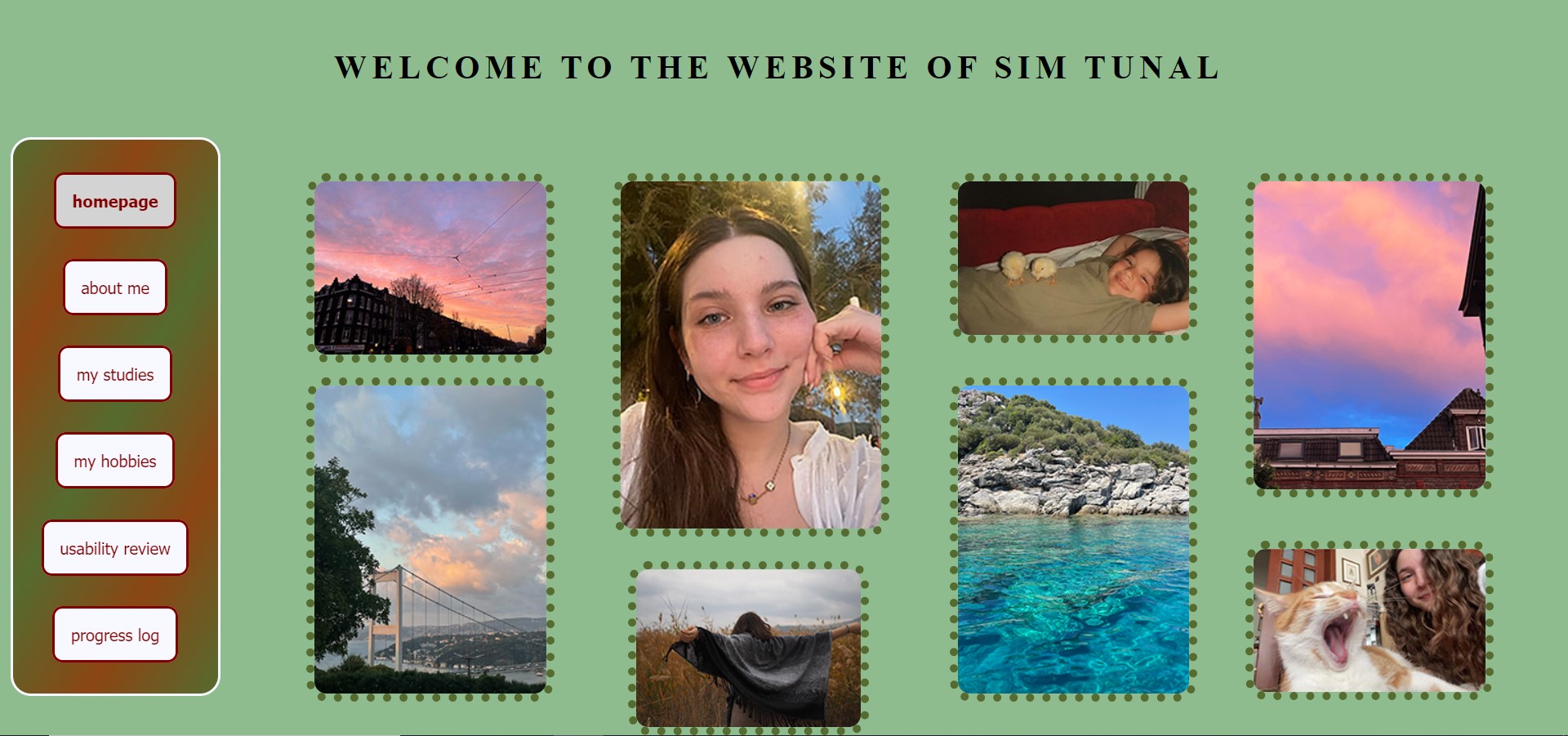
Overall, Sim's web page is a really nice and clean looking page with colors that contrast nicely. By clean I mean that it looks very organized and soothing to the eye. Her use of images on the pages is nicely accentuated by the dots surrounding the images, which is shown on the picture of her homepage I put on this page.
Sim's web page is easily scannable, as there is no distraction or design noise and everything is very clear. For example, it can be easily identified what each page is about. On the about me page Sim clearly speaks of herself, on the hobbies page Sim clearly speaks of her hobbies and the same goes for the studies page. There are not a lot of objects to click on and the objects that are clickable are identified by an underline or block, which makes the clickable objects very obvious. The texts are also easy to scan as they are easily readable, because of the font and the color of the texts compared to the background color. The texts are also placed similarly on every page, which makes it obvious where to look for the text.
As far as happy talk goes, I did not identify any on Sim's web page. Everything she wrote was pretty straight to the point, for example starting by explaining what study program she follows. Only after she explained this, she explained how she got here and what her first choice of study program was. So if there were any happy talk, I would only be after the "important" information that is expected to be on the page.
The navigation menu is very user friendly, as it is clearly displayed and placed on the same place on every page. The clickable blocks in the menu that lead you to a different page clearly indicate their destinations. The navigation menu also contains a link to the homepage. Furthermore, the 'you are here' indication of the navigation menu is present. However, I did not see it at first, which might mean that it is not prominent enough. Maybe if the color change is a little more defined it would be easier to see. But hey, that might just be me :)
The homepage defines what Sim's web page is about by describing it with images. Because of these images, it is easy to identify that the web page is about Sim and what she likes in broad lines. I believe this is a better way to define what your page is about than using text, as in my opinion a lot of text on a homepage does not look very nice.
I cannot really think of any usability improvements for Sim's web page as it covers all the points in this weekss assignment. I believe Sim's page is very user friendly and one of the nicest web pages I have seen on the student list. Well done Sim!