Peer site review of the site of Jorien Wolthuis
Scanability and Readability
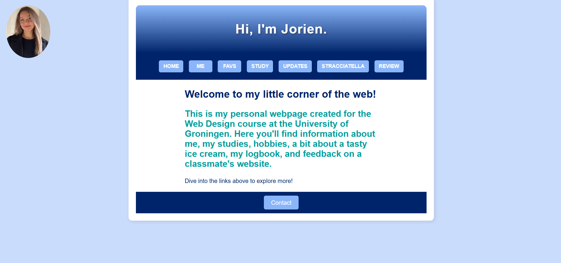
The webiste allows visitors to easily review its content thanks to a straightforward structure. The headings are obvious and the introduction to purpose of the site is also very clear. By expanding some of the terms like: 'FAVS' to hobbies, or favourites, it might be more clear what to expect when clicking that box.
Clickability and Interaction
The website effectively shows what parts of the interface viewers can interact with. The web navigation with main links "ME" "FAVS" "STUDY" "UPDATES" follows standard arrangement and leads to expected interactive results. The website contains easy-to-find social media links which include both Instagram and LinkedIn. Also maybe add a part where you can see in which menu you are, that would make the overall experience more pleasant.
Distractions and Design
The site is very clear and there are very little distractions. However, certain terms (like "DOEI") detract from the site's professionalism. These incomplete sections should be finalized to avoid leaving a unprofesseional impression. The overall design is consistent in fonts and colours across the different pages.
Navigation and User-Friendliness
The navigation of the site is very straightforward but could be improved by implementing a fixed navigation bar across all pages. The homepage effectivley introduces Jorien and her site's purpose, though a tagline such as "Where I share my interests, knowledge and favourites" could make the intro more snappy!
Suggested Improvements
- Introduce a fixed navigation bar with all the same buttons and the same layout.
- Highlight the current page in the navigation menu, this way users always know on what page they are.
- Remove or complete unfinished sections like the section below with DOEI maybe this should be the same as every other page.