Usability Review of the Website
This is a web usability review for the website listed just below mine in the current list of participants. This review reviews several key usability factors to evaluate how the website functions for its users.
Website Link
You can visit the website I reviewed here: Kirsten Wolthek
1. Is the most important term of each page also displayed as the most prominent one?
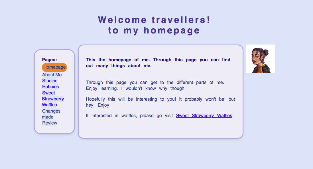
Yes, the most important terms on each page are clearly displayed as the most prominent ones. For example, on the homepage, the phrase "Welcome travellers! to my homepage" is the largest and most eye-catching text, which gives the user a clear introduction to the site’s purpose. Similarly, on the pages such as "My Studies" and "My Hobbies", the section headings, like "Arts, Culture and Media" and "Art and Drawing", are displayed in a way that helps the user easily identify the core content. However, there could be improvements in consistency across the different sections by ensuring all page titles are similarly emphasized.
2. Is it obvious what is clickable?
The clickable elements are obvious. All navigation links change color when visited, which is a clear indicator of interactable elements. Additionally, the image map on the homepage serves as a good interactive element, with specific areas of the image clearly marked as clickable. That said, adding more visual cues to other links, like small arrows or icons beside text, could help further clarify what is clickable, especially for users who might not be familiar with this type of navigation.
3. To what extent is there distraction or design noise?
The design of the website is simple and clean, with minimal distraction or unnecessary elements. The choice of a light background and subtle color palette helps maintain focus on the content. The fixed navigation bar on the left is practical and doesn’t take up too much space.
4. Are the texts easy to scan?
Yes, the text on the site is generally easy to scan. The use of bold text for headings and subheadings, as well as the use of bullet points, helps break the content into manageable pieces. This makes it easy for users to skim through the page and find the information they are looking for. However, on some pages, such as "My Hobbies," the blocks of text could be spaced out a little more to enhance readability. Adding more subheadings within each section could also help to make the text more scannable.
5. Do you see 'happy talk'?
There is a small amount of what could be considered "happy talk" or overly casual language on the site. For example, on the homepage, the text "Hopefully this will be interesting to you! It probably won’t be! but hey!" comes across as very informal. While this adds personality and humor to the site, it may not align with the professional tone that could be expected for a personal or academic website.
6. Is the navigation user friendly?
Yes, the navigation is user-friendly. The navigation bar is fixed at the left of the page, so it remains accessible as users scroll through the content. The links are clearly labeled, making it easy for users to find their way around the site. The use the navigation bar on the left is a good choice for accessibility, as it prevents users from having to scroll back to the top to navigate. One small suggestion would be to improve the visibility of the links by increasing the contrast between the background and the text.
7. Is it at a prominent location?
Yes, the navigation is located in a prominent position at the left of the page. It is fixed in place, so users can easily access it no matter where they are on the page. This is a user-friendly design choice as it keeps the navigation always visible, making it easy to navigate to different sections of the site.
8. Is it consistent?
Yes, the navigation bar is consistent across all pages. The same links appear in the same order on every page, making it easy for users to predict where they can go next. This consistency is a key part of a user-friendly design, as it reduces the cognitive load for users and helps them feel more comfortable exploring the site.
9. Does it include a link to the homepage?
Yes, the navigation bar includes a link to the homepage. This link allows users to easily return to the main page no matter where they are on the site, ensuring they don’t get "lost" while navigating.
10. Is there a 'you are here' indication?
Yes which is highlighted by orange.
11. Does the homepage clearly indicate what this site is about?
Yes, the homepage gives a clear introduction to the site, stating that it is a personal website. It invites users to explore different aspects of the site, such as hobbies and studies. However, the homepage could benefit from more contextual information about the site’s purpose. For instance, a brief description of the content or the intention behind the website could be included to make it even clearer to first-time visitors.
12. What other usability improvements can you suggest?
- Improve contrast: Enhancing the contrast between the text and the background will make the site more readable for users with visual impairments and in low-light conditions.
- More subheadings: Consider adding more subheadings within the content sections to make the pages easier to scan and read.
- Refining tone: Adjusting the tone of some of the content to be more professional while retaining personality could make the site feel more polished.
Website Screenshot